Create graph for requests per minute and uri

3

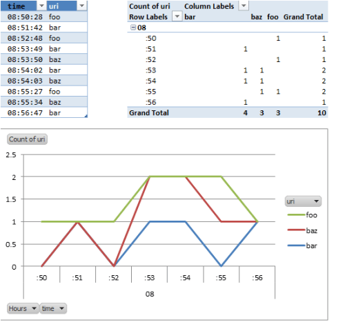
I have a table that looks like this.

time|uri
08:50:28|foo
08:51:42|bar
08:52:48|foo
08:53:49|bar
08:53:50|baz
08:54:02|bar
08:54:03|baz
08:55:27|foo
08:55:34|baz
08:56:47|bar

I would like to make a line graph with a line for each uri and the height of the line to be determined by the amount of requests per minute. How would I go about doing this?

Philippe

Posted 2014-02-07T14:04:48.217

Reputation: 145

Answers

4

Assuming Excel 2010 (but principle works in other versions:

  1. Convert your data to an Excel Table.
  2. Create a Pivot Table from your Excel Table data. Use URI for your columns, Time (Grouped by Hour, Minute) for your rows, and URI Count for your Values.
  3. Create a Chart from your Pivot Table. You'll have to determine whether you want a regular Line or Stacked Line chart (based upon what you're trying to show).
  4. Format to taste.

Here's what it could look like (Excel defaults in all of their glory):

Line chart grouped by minute

dav

Posted 2014-02-07T14:04:48.217

Reputation: 8 378