3
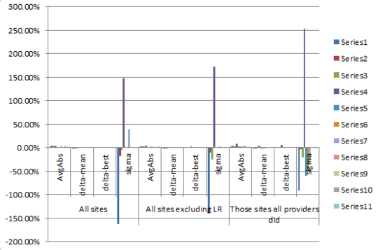
How do I make the X axis labels of a column chart looks like this? i.e. with, for lack of a better name, "super-categories" or "headers", like the labels "All sites", "All sites excluding LR" etc. in the image below.
Excel 2010 made this one automatically. A cell happened to be selected when I inserted a chart; if that cells happens to be in an area with data, then Excel will take a guess at what your chart should look like and make that automatically. That's what happened to me. I didn't even know this was possible; I just stumbled upon this.
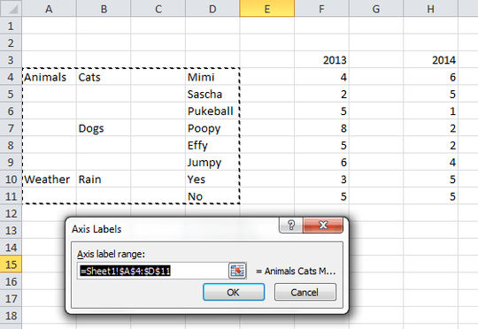
Now I'd like to know how to reproduce this manually. i.e. without relying on Excel's automated reaction described above.


I'm not sure I get you here. What do you actually mean by 'Excel made this one automatically'? And what would 'manually' equate to? I usually make such graphs in Excel (2007) through PivotCharts (i.e. making a PivotTable first however, then using inserting a chart). – Jerry – 2014-01-23T15:50:59.537
You know, when a cell happens to be selected when you insert a chart; if that cells happens to be in an area with data, then Excel will take a guess at what your chart should look like and make that automatically. That's what happened to me. – Jean-François Corbett – 2014-01-23T16:15:09.323
Okay, and what would you call making it manually? Like setting up your data so that you will always get that result? – Jerry – 2014-01-23T16:22:22.263