Get Excel to use column of numbers as labels (equally-spaced on x-axis) instead of as x values (x-axis co-ordinates)

1

0

It could be an easy question but I can't find a proper way to accomplish my task.

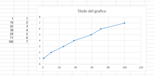
I have a simple graph and all I want is to show the X values I wrote in the first column at the bottom of the graph (in X-Axis label). It's ok to have some kind of "scale marks" (20 - 40 - 60...) on a 1-100 scale, but I need those values to be shown.

In this Picture you can see what I get with a scatter graph (I've tried other types but without success). Values have a "gap" of 20 but my X values (first column) are not shown in the X-axis.

How can I add them? Thanks in advance

enter image description here

Rob013

Posted 2013-07-12T11:29:43.033

Reputation: 111

Answers

1

Add a column of zeros to the data.

The first chart below has your original data; the second includes these zeros, which appear along the X axis.

In the third chart I've added data labels below the second series of points (temporarily colored orange to match the series). These show the Y values, all zeros.

In the fourth chart I've formatted the data labels to show the X values instead of the Y values.

In the fifth chart, I've used the custom number format " " (double quote, space, double quote) for the X axis tick labels. This maintains the spacing below the chart for the labels, where using None for the label option would have squashed the chart and overlapped the data labels we've added.

Finally I've restored the data label font color, and formatted the added series so it uses no line and gray cross markers to indicate the position of the other points projected to the axis.

X Values of Points as Labels Along X Axis

Jon Peltier

Posted 2013-07-12T11:29:43.033

Reputation: 3 470

0

Ok, it was simple indeed. Scatter graph and similars can't display the values as I wanted.

Solution: Left click on graph -> change type -> Line Graph -> Here you go

Rob013

Posted 2013-07-12T11:29:43.033

Reputation: 111

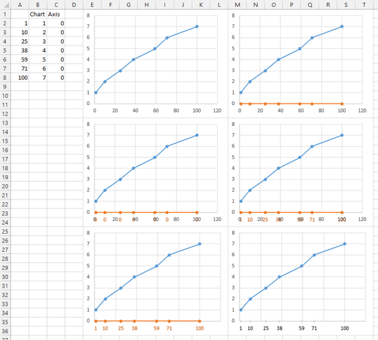
You don't want the X values to be displayed proportionally? In a line chart, the distance between 1 and 10 (9) will look the same as that between 10 and 25 (15), and the same as all of the differences. – Jon Peltier – 2013-07-21T14:21:16.277