It is very easy to make a chart like this in Excel. You'll just need to change your data layout.
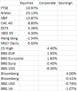
- List all of your category labels are in a single column.
- Create a column for each category type (e.g. equities, corporate, sovreign...)
For each category, just place the value in the appropriate categories column. Your data should look something like this:
Then, create a Clustered Column Chart Insert>Column>Clustered Column.
- Select your data series, then
Format>Series Option>Series Overlap and set the value to 100%.
- Format to taste (e.g. move horizontal axis to low, remove grid lines, adjust percentage decimals to 0, etc...)
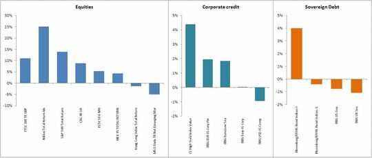
Your completed chart should look something like this:
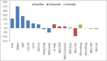
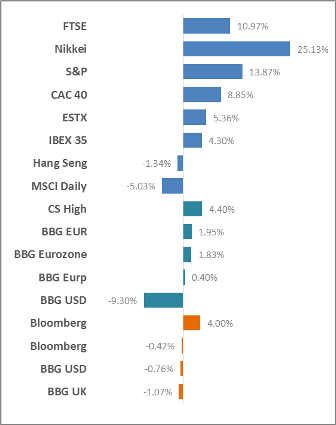
FWIW, I'd consider a Bar Chart laid out in similar fashion (just insert Clustered Bar instead of Clustered Column). Cleaned up a bit, it would make your category labels easier to read (horizontal, rather than vertical) and can be compressed a bit easier into a smaller space.


1Nicely answered. – CharlieRB – 2013-06-06T12:26:52.233