0
I have two value columns that I want to add to a pivot table, one an average, and one a sum.
When I add either one to the table, it look fine. When I try to add the other one, there is new entry in the Column Labels box that says values (essentially, all my averages or sums get turned into individual columns. That is NOT what I want).
I just want the two sets of columns (one is a set, one I want to be ignored by the current column labels) to exist peaceably side by side, resulting in a grand total one more column in the pivot table, as if the second value column was just another column that was part of the table.
Can this be done?
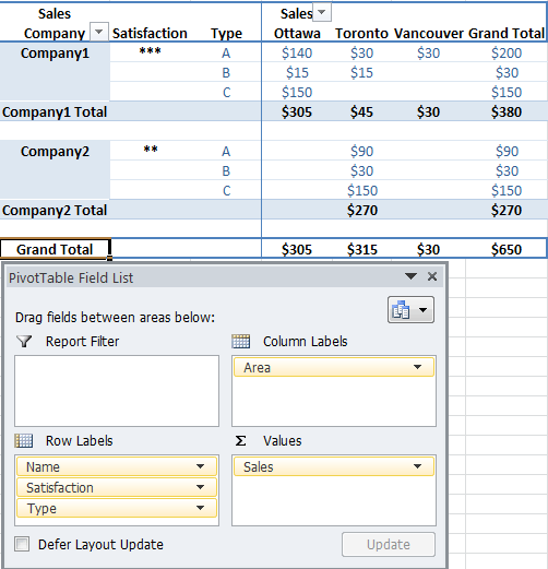
Edit: Assume my data has five columns; Name, Area, Price, Type, and Satisfaction. I want the companies grouped by area, have the prices for all the rows that contain an interaction with a company in an area summed with a breakdown by type shown, and have a satisfaction rating for the company in that area shown.
I use column labels, and a value to do the first part, but then when I try to do the second part, the column labels interfere.

soandos
Posted 2012-01-25T03:31:25.100
Reputation: 22 744

I want to accomplish exactly what your first table looks like. The problem is that it creates two stacked column labels (i.e. for one value it creates four columns (that is what I want for that), but for the second, it tries to create all possible combinations of the two different value columns as the columns (I do not want that). – soandos – 2012-01-25T04:05:35.403
More accurately, I want one of the value columns to ignore the column labels – soandos – 2012-01-25T04:06:53.467
You will achieve the same result as my first example if you always drag and drop fields to the VALUES box. Even if you have a dozen of sums and averages and percentages (a dozen of columns), there will still be only ONE item in the column label area, that is "Values". In other words, never add something to COLUMN LABELS. – mtone – 2012-01-25T04:13:10.090
The best way to look at it is this: You add stuff to Row or Column LABELS when you want to SEE each individual item shown (such as companies, cities, years). You add stuff to the VALUES box when you want to do calculations: sums/counts/averages/etc. – mtone – 2012-01-25T04:14:04.207
Not what the problem is. I have column labels that do what they are supposed to with one value coloumn. I want the other value column to ignore the column labels, and just be its own column – soandos – 2012-01-25T04:29:24.537
I see.. From my experience, that can often get messy. By design having several Column Labels and values mixed will generate all possible permutations by the order you place them. It may be possible to work something out with a combination of: inverting the order of items in the Column Labels (putting Values first or last), grouping data and finally merely hiding unwanted columns. Again, try to provide a specific example if possible. – mtone – 2012-01-25T04:37:27.803
See edit (pad).. – soandos – 2012-01-25T04:46:32.653
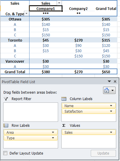
@soandos Added a screenshot. Basically, I generally try to avoid having more than one items in ColumnLabels unless it does not cause additional permutations (like Company+Satisfaction). A single column that acts as a divider (here, Area, or Company) is usually the most that's readable. – mtone – 2012-01-25T05:00:26.363
It is perfect except that the satisfaction is on a different row than the type. Why is this the case? – soandos – 2012-01-25T05:07:28.843
1@soandos If you click on a field, "Field Settings", "Layout" tab, you can pick Tabular form so the next item will show on a new column, or "Outline" + check "Compact Form" to have it show under (like my 2nd screenshot, where Type is below the Company name). – mtone – 2012-01-25T05:15:58.677