5
3
There are a lot of hacks to fill the area between two lines in a chart; however, I want one that works seamlessly between 2003/2007 and mac 2011. Preferably, something that is not a hack.

dassouki
Posted 2011-01-14T02:26:36.163
Reputation: 982
5
3
There are a lot of hacks to fill the area between two lines in a chart; however, I want one that works seamlessly between 2003/2007 and mac 2011. Preferably, something that is not a hack.
dassouki
Posted 2011-01-14T02:26:36.163
Reputation: 982
8
I realize this is an old post, but I came across it looking for the same thing and created simple how-to with a data set and examples.
I recently had the need to create an Excel chart with the space between two lines shaded. After searching the Internet I was still confused on the best way.
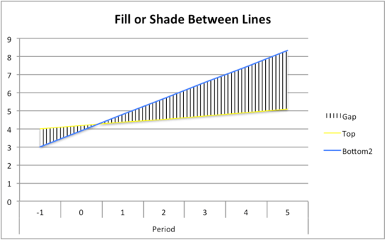
I figured there had to be a way and after a few hours I came up with the following idea. The simplest way I have found is to use a mix of stacked bar chart and line charts.
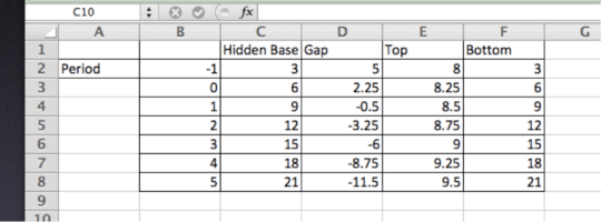
The first thing to do is layout our data. For this example I used the following data:
In Excel Mac 2011, create the following data in columns A through F:
A: Leave A1 blank, in A2 put the title "period"
B: Leave B1 blank, in B2 through B8 enter: -1, 0, 1, 2, 3, 4, 5
C: C1 through C8 enter: Base, 3, 6, 9, 12, 15, 18, 21
D: D1 through D8: Gap, =E2-C2, =E3-C3, etc..
E: E1 through E8: Top, 9, 8.25, 8.5, 8.75, 9, 9.25, 9.5
F: F1 through F8: Bottom, =C2, =C3, =C4, etc...
The things to pay attention to in the data set are:
The X (horizontal) axis label is offset to the left of the first column of data to let Excel know that this column is the x-axis and not another data set.
The second column, “Hidden Base” and the last column, “Bottom” are the same data. I actually used =C2, =C3, etc… for column F.
The Gap column calculates the difference between the Top and the Hidden Base, =E2-C2, =E3-C3, etc..
Select the entire data set, A1 through F8, and create a Stacked Area chart.
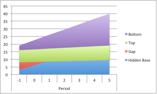
Notice how the x-axis has “Period” as a label.
Next, select the “Bottom” series, which should be on top, by clicking on it and changing the series type to a Marked Line.
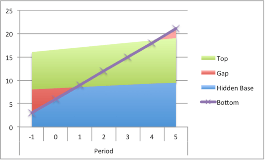
Do the same for the “top” series.
Now, select the “Hidden Base” series, right click and select “Format Data Series” and choose “No Fill”, “No Line” and turn off shadows.
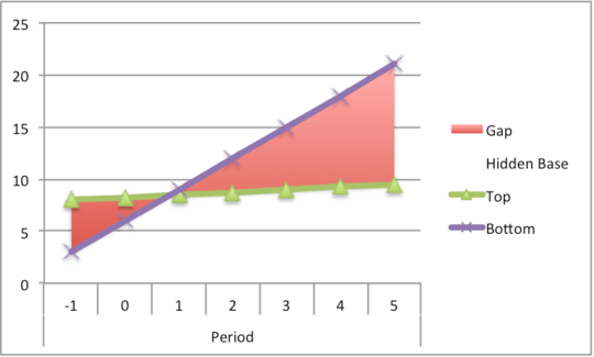
Now select the legend and then select the “Hidden Base” key and delete it.
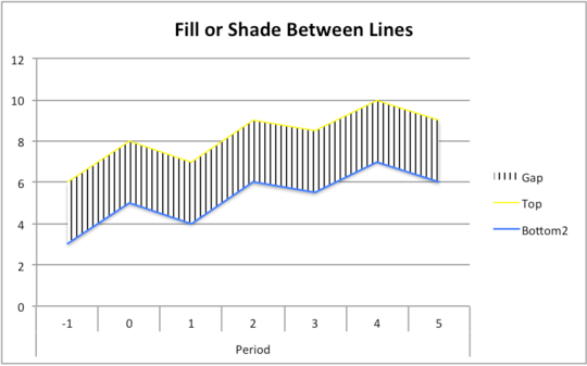
At this point you can adjust the markers, fills, line weights, titles, etc.. to achieve whatever your looking for.
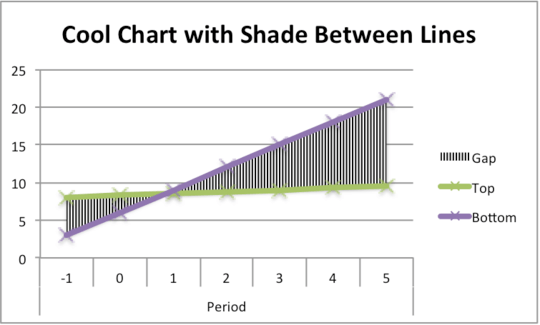
You can also adjust the data and the shaded area continues to work well.
Enjoy! I hope you find this helpful!
See the post here as well: http://www.illuminateandenumerate.com/2013/11/how-to-fill-shade-between-lines-in.html

ScottAndrewRogers
Posted 2011-01-14T02:26:36.163
Reputation: 379
0
Best I think of is using an Area chart and filling the lower area with white so you get something like this.

Rhys Gibson
Posted 2011-01-14T02:26:36.163
Reputation: 4 218
the problem happens if you have 2 or more of these areas you want to display on the same plot – dassouki – 2011-01-14T15:04:14.857
Do you have a specific example data set or example chart that we can fiddle with? – Rhys Gibson – 2011-02-01T19:29:40.520
Yeah, this makes no sense. Can you please give an example, with an image? – None – 2011-01-14T02:38:27.927
@Randolph Potter - http://www.google.ca/images?um=1&hl=en&safe=off&biw=1280&bih=659&tbs=isch:1&sa=1&q=area+between+2+lines&aq=f&aqi=&aql=&oq=
– dassouki – 2011-01-14T02:40:33.713