Excel Graph: how can I show two values in the same bar? Not using stacked?

3

I've created some data for inventory items over time. Each item has two models (A & B), and the scale is (-) or (+). I've included example images of the type of graph (drawn) I'm aiming for, with an image of the data table it would come from.

The inspiration for the 'look' has come from Jon peltier's site, called Conditional Stacked Clustered Column Chart with Targets. I don't need anything as complicated, but it's turned out to be trickier than I thought.

I've tried overlapping, removing the fill, changing one series into another type, etc. Nothing really worked.

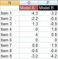
Graph Graph Data

RocketGoal

Posted 2010-09-16T14:58:56.747

Reputation: 1 468

Answers

1

Here's the result I've come up with that doesn't require a lot of messing around to create. Uses the input data provided.

It's not exactly what you're after because Model B isn't just a vertical line, it's an entire outlined bar, but should convey the information in effectively the same manner.

You can get it closer to you're desired output by giving B some error bars (all of zero size) and hiding the bar completely, but unless you do as dkusleika and variant have discussed in terms of mixing graph types and using secondary axis you cannot set the error bars to vertical so they aren't much good.

alt text

Instructions (using Excel 2007)

Create a clustered bar chart from the data.

Edit the y-axis; setting the labels to low, and reverse the category order.

Then edit the series Model B, set fill to none and increase the border weight.

On any series (as it changes them all) set the overlap to 100 and gap width to ~50.

DMA57361

Posted 2010-09-16T14:58:56.747

Reputation: 17 581

Thanks. I've seen this option as well. I think I'm going to create the two types of graphs mentioned in the answers and see which one 'looks the best'. – RocketGoal – 2010-09-17T11:58:23.717

1

Add a fourth column to your data with the values 1-9 corresponding with Items 1..Item 9. Create a stacked bar chart with that data.

Change Model B to XY Chart. For Model B, make the X Values C2:C10 and the Y Value D2:D10.

Hide the markers and add Y Error bars (both) at a fixed value of .25. Format them as thicker and without the wings.

Fix the Y axis scale to 0.5 to 9.5 (this linkes up the secondary axis with the primary). Fix the secondary X axis to -5 to 5.

Finally, download http://www.dailydoseofexcel.com/excel/StackedBarErrors.zip so you can get all the stuff I forgot to tell you.

Note, as variant said, that fixing the axes makes the chart less flexible.

dkusleika

Posted 2010-09-16T14:58:56.747

Reputation: 1 776

I'll give it a go. By the way, where do you learn the stuff about messing with the data and it's structure? Adding columns here and changing scales there...the type of stuff that allows for more comprehnsive graphs/charts to be built. Thanks again. – RocketGoal – 2010-09-17T12:01:01.247

Jon Peltier taught me everything I know about charting (no bad reflection on him-I'm a slow learner). I started with his page that you linked to and tried to get rid of the color part and convert to a bar chart. Then it was just trial and error until it looked right. Going through some of his other example even if you don't need them is useful just to get your mind thinking in different directions. Good luck. – dkusleika – 2010-09-17T16:12:32.367

0

Jon Peltier

Posted 2010-09-16T14:58:56.747

Reputation: 3 470