Datetime X-axis in Excel with proportional distances between value points

0

There are countless of Stack posts about how to create a datetime X-axis in Excel (change from Number to Text in the axis formatting) but this only solves the display of the text. I would like to have a timeline where the data points are proportionally distanced from each other based on the time difference between when the data points where taken.

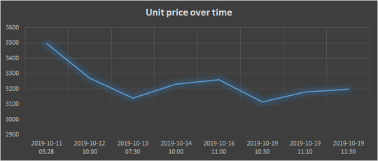
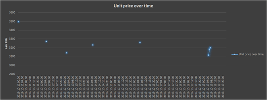
Let's say that I want to have one tick on the X-axis represent one hour of time. I want to then, on that timeline, add certain data points to this axis. If I just plot them with the standard Text formatting on the X-axis it becomes something like this:

enter image description here

As you can see, the data points weren't taken at the same time every day, sometimes you have several data points for one day, and some days none were taken at all. What I want to have is something along the lines of the following:

enter image description here

To make this work I created a series with empty entries for every hour except for the ones that I had values for but this is a pretty crappy workaround. Is there any way to get a proportionally spaced X-axis in Excel without creating dummy zero-values like this?
MagneTism

Posted 2019-10-20T17:09:17.950

Reputation: 419

1What kind of chart are you using? An XY scatter should have the data points spaced proportionally. – Ron Rosenfeld – 2019-10-21T00:40:38.837

Answers

1

There are two basic approaches. Either (1) you use an X-Y chart to plot the points you want spaced properly on the X-axis as well as the Y-axis, or (2) you define a conventional category axis with a resolution of 1 hour and then synthesize the hourly data you need by interpolating between the data points you actually have (set a fill colour and switch of borders for data series)

Usually using an X-Y chart is the best approach but there are thing you can do with e.g. area charts you couldn't do with X-Y ones (and vice-versa). Though if you want to do something fancy you may well be better off finding an add-in that does it for you.

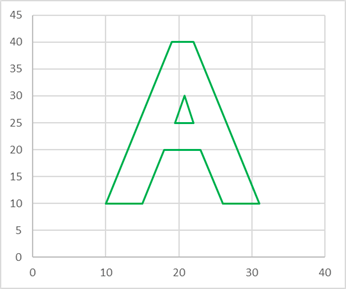
For example, with an X-Y chart you can plot arbitrary things, like this:

Arbitrary drawing with X-Y chart

You could just paste the shapes in a pictures, but they are not then precisely aligned to other chart items whereas this way the lines change to reflect scale changes.

Alternatively, as you can't fill in an X-Y chart, you can use a area chart, but to make it work you have to create a series with suffient categories to represent the detail (say 100 in this case) and interpolate the datapoints to give the intermediate values between your actual data points:

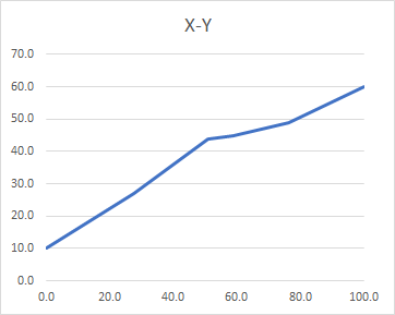
So here is the normal X-Y chart (which you can't fill in):

Conventional X-Y chart (can't fill it with a pattern)

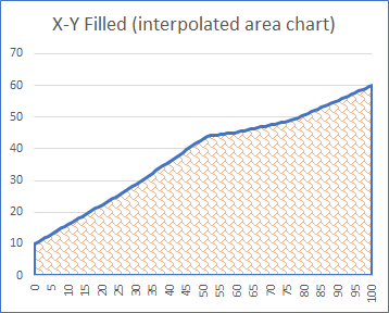
But if you simulate it using an area chart (which requires the calculation of a large number of intermediate points) you can create something very similar:

Simulation of an X-Y chart using an area chart

One key limitation of this vs the X-Y chart proper is that you can't go 'backwards' on the X-axis. The X-values have to be strictly increasing.

Still, these give you some additional options if you find them useful.

Duke Bouvier

Posted 2019-10-20T17:09:17.950

Reputation: 306

The first paragraph here is fine. I don't know what the second paragraph is getting at. – Jon Peltier – 2019-10-24T03:00:17.293

I'll extend the answer to explain... – Duke Bouvier – 2019-10-24T09:44:07.407

Okay, I see what you were saying. Quite a bit more than the user seemed to need, which is why I wondered. Since the horizontal axis is numeric in your example, with a suitable scale, you don't need to do all the interpolation. Just make the axis a date axis, and Excel properly spaces the points. See Line-Area Pseudo-XY Chart for a brief illustration. You could use this approach for the original data, but it requires some manipulation to get non-fractional axis increments (dates not times).

– Jon Peltier – 2019-10-25T15:12:36.263