1
I have an Excel worksheet that has overtime (OT) data for each person in the company summarized per pay period. My objectives in Excel are as follows:
- Show a current pay period summary of OT hours by department (sorted with most hours at top); If the solution is within the PivotTable it would be nice to ONLY show the current pay period (and applicable trend averages) if possible
- Provide simple trend data (4 pay period AVG and YTD AVG) to make the current pay period data more relevant.
- Make the analysis/tool/table easy to refresh by simply adding new rows to raw data; this will be provided to an HR admin so it must be user-friendly for updating every time period.
Here is my raw data:

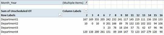
Here is the pivot table:
Ideally, the user could select the current pay period, and that would display the OT sum for the current pay period and the two averages mentioned above. From there, I would add conditional formatting to improve the UI for the managers/end users of the data.

Rob R
Posted 2018-08-27T19:02:15.457
Reputation: 11
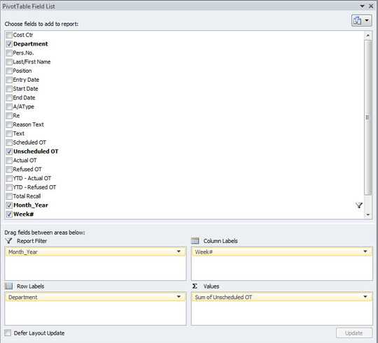
Not sure what your column labels are from. Could you add a screenshot of the Field List for this Pivot Table? – Rey Juna – 2018-08-27T19:39:56.003
Column labels are the "Week#" which is the last column in the "Raw Data" (image above). The "Week#" corresponds to the pay period; bi-weekly for 26 annual pay periods. – Rob R – 2018-08-27T19:52:42.620
I would suggest making the raw data into a table, if isn't already, to make updates easier. And do the trend calculations in the table and then reference them in the Pivot Table. As to the current pay period, it appears that you already have that covered in your column labels for you should be able to select the pay period that way. I'm not sure about the
Month_YearReport Filter. Why do you need both this andWeek#? Could get a little confusing. – Rey Juna – 2018-08-27T20:39:01.877Hi Rey, I think the difficulty in doing the trend calculation prior to the Pivot Table is that each row in the Raw Data is for an individual employee for a single time period whereas the trend calculations are by department. The "Month_Year" filter is being used because the table has data all the way back to 2016 and the "Week#" field repeats every year; 1 -26. Does that make sense? – Rob R – 2018-08-27T20:45:51.087
I think I understand. This may be doable directly in a Pivot Table, but if I was to try it I think I would create an intermediate table, using formulas such as
SUMIFS, to consolidate and trend the department data and then pivot off of that. OBTW, if the important data is Year and Week#, then recommend that you create another column for just the year. – Rey Juna – 2018-08-27T22:26:28.403Thanks Rey. I'll give the intermediate table a shot. If I can do the 4 period and YTD AVG in an intermediate table and link it to a specific week in the table. I could Pivot Table the data and only show the user data relevant to the current time period. That would be a clean, informative view of the data. – Rob R – 2018-08-28T00:35:13.830
with Pivot table alone, you won't get what you wish. You have to compute the data with Power Pivot and a data model.
– visu-l – 2018-08-29T11:51:21.613