0
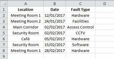
I have an excel spreadsheet that currently tracks fault reporting in our building. I am looking to do some form of trend analysis ideally to track the faults on the spreadsheet and then display them (by monthly totals so would also need to group them) in a multi line chart.
So for example at the bottom of the chart is date range by month, left column is fault totals, right column is type of fault.
I have attached a basic example of my spreadsheet

R.DK500
Posted 2018-04-19T14:35:24.363
Reputation: 1

Is your data really that sparse, 2-5 faults per month? If so, with 5 or more fault types, it will be hard to do any meaningful analysis. – Bandersnatch – 2018-04-19T17:01:31.453
No apologies we actually usually have around 10-15 a month however i gave a quick example spreadsheet as the original contains sensitive information – R.DK500 – 2018-04-20T16:11:56.787