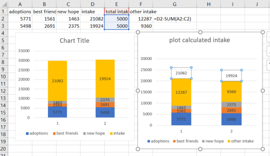
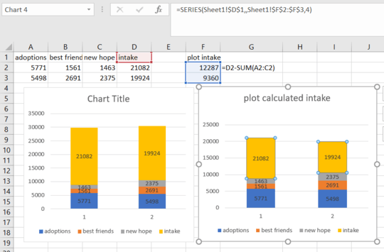
You can create the illusion of having the three series "inside" the yellow series by subtracting the sum of the three series from the yellow series and using that number for the yellow series. Compare the two charts in the screenshot. The one on the right uses the calculated values in column F for the Intake series. The data labels for the Intake series point again to column D, to show the total number for Intake, but you can change that, of course.

It may be a bit misleading if the yellow series data label shows the total of all series. You may want to consider showing the yellow series "Other intake" value. Then add another helper series on top to show the total intake. Give it an arbritrary number, just so its plot height is sufficient, then set the fill to "no fill" and point the data label to the values in column D.
