3

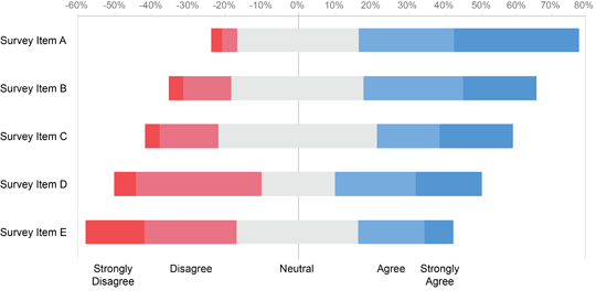
This is the chart that I had in mind. Similar to this chart, I have values for the amount of people that answered Agree/Neutral/Disagree to a specific question. Is there a way to center these answers around the middle of the "Neutral" category, just like in this chart? I can't seem to figure this out.

Please post a small sample of your data. – Gary's Student – 2017-01-31T13:38:09.233
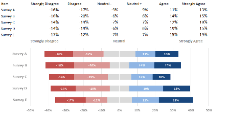
Without your data I can't give much better advice other than to make sure you have positive and negative data being used and use a Stacked Bar Chart. Chandoo did do a breakdown of this on his site previously - see here: http://chandoo.org/wp/2013/02/21/advances-vs-declines-chart/ - That might help more than an answer here :)
– Miller86 – 2017-01-31T16:07:21.977