0
I have created a clustered column chart where I inverted value so the series became the "categories" and the dates became series and just manually adjusted the coloring. I have attached an image. Basically, I want to add a line to it, but when I do it compares across dates so is inaccurate. ALso added an image of how the data is set up and the "inverted look to it"
Image of table: 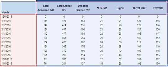
Image of Graph: 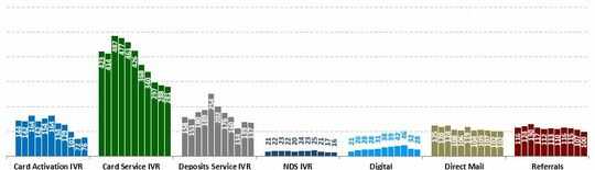

erenc
Posted 2016-12-16T16:51:11.873
Reputation: 1
What line do you exactly need? please post also the picture with the line and explain what's wrong with it. – Máté Juhász – 2016-12-16T16:59:42.357
1If you mean a trendline you'll need to split this into 7 individual charts and add a trendline to each one. You can make it look like one chart by giving them all the same axes max/mins, removing gridlines, then putting a wide chart with invisible data but visible gridlines behind all 7 small charts. – Andi Mohr – 2016-12-16T17:25:42.043