Although ClearType was not designed specifically for CRTs, I found it greatly improved text rendering quality when I tried enabling ClearType on my CRT years ago. Of course it's probably less effective than LCDs because of the differences in pixel layout, but still better than none. Probably it'll be better on monitors with aperture grille. This is what Microsoft said:
ClearType Antialiasing
Microsoft ClearType antialiasing is a smoothing method that improves font display resolution over traditional antialiasing. It dramatically improves readability on color LCD monitors with a digital interface, such as those in laptops and high-quality flat desktop displays. Readability on CRT screens is also somewhat improved.
https://docs.microsoft.com/en-us/windows/desktop/gdi/cleartype-antialiasing
Q. Will ClearType improve text display on CRT monitors?
A. Yes, but less so than with LCD displays. Because a standard cathode-ray tube (CRT) screen uses an electron beam to activate pixels, ClearType does not provide the same benefits that you experience on an LCD screen. However, because ClearType still applies a form of filtering similar to traditional antialiasing, you may see some improvement when enabling ClearType on a CRT screen.
https://web.archive.org/web/20110228032333/https://www.microsoft.com/typography/ClearTypeFAQ.mspx
More specifically, the ClearType technology is optimized for LCD panels with red, green, and blue (RGB) striped sub-pixels that are oriented vertically, although it performs reasonably well on CRT displays (especially those that are aperture grille based) and even LCD panels with horizontally oriented RGB stripes. Although this might seem counterintuitive, through informal studies, we’ve found that about 70% of users prefer ClearType even on these non-optimal displays. Of the 30% who preferred other rendering techniques, their biggest concern with ClearType in these non-optimal cases was the loss of text contrast.
...
Even though there were still CRTs in use, feedback from Windows XP customers was positive on the quality of ClearType rendering on CRTs. After we made the choice, the feedback on the decision to enable ClearType as the default for Windows Vista was overwhelmingly positive.
https://blogs.msdn.microsoft.com/e7/2009/06/23/engineering-changes-to-cleartype-in-windows-7/
To get the full benefit of ClearType, you need a high-quality, flat-panel monitor, such as LCD or plasma. Even on a CRT monitor, you might get some improvement in readability with ClearType.
https://web.archive.org/web/20160604190936/http://windows.microsoft.com/en-in/windows/make-text-easier-read-cleartype#1TC=windows-7
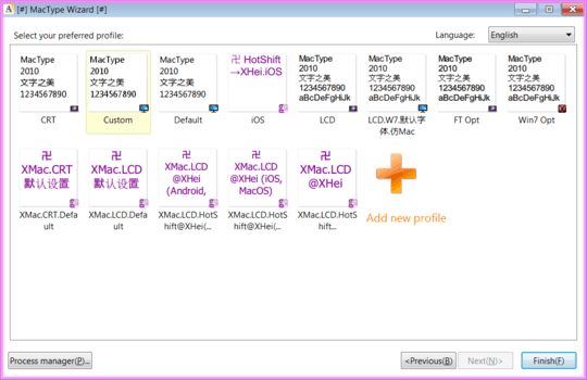
If that doesn't work for you, you can try 3rd party rendering solutions like GDIPP or Mactype which has a profile for CRT rendering, or you can create your own profile
Anything (apart from GDI++) to improve font rendering on Windows?


2I am unaware of any CRT display ever having sufficient precision or sharpness to address individual phosphor dots. Instead, the beam is deliberately made diffuse enough so that it's always hitting more than one set of phosphor dots at a time. If it weren't, it would be necessary to calibrate many parameters associated with scanning to within a tenth of a percent; it might be theoretically possible for a continuously-self-calibrating system to manage that, but I'm unaware of any having been designed to do so. – supercat – 2014-11-16T22:21:49.153
1Good explanation. ;-) – GeneQ – 2009-07-23T15:02:39.710
6+1 - I wondered why everything I read always said that ClearType didn't work on CRTs, when it looked great on the CRT I used to usse. – phenry – 2009-07-23T15:07:27.737