Aside from looking prettier, there's usually no reason to use smoothed lines. Not if you're plotting real data. The smoothing hides the fact that you only have a handful of data points. I'm always a little suspicious (no offense) when I see a chart with smoothed lines, and I always recommend that people not use them.
The most honest way to plot the points is with markers connected with straight line segments.
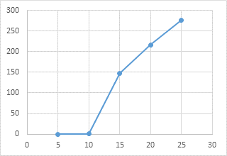
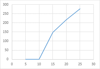
If you omit the markers but just show the straight lines, you get the following, which still has a slight indication of the scarcity of data.
If you absolutely must use smoothed lines, you can eliminate the dip without actually fudging your data (as suggested by @scott), by merely duplicating the second data pair.
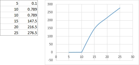
Not really different from the previous graph, with straight segments.
Edit by fixer1234: Understanding why this works is as useful as knowing that it works, and the reason isn't necessarily intuitive. Quick, simplified explanation:
I'll refer to the five XY data points as the letters A through E. Excel creates the smoothed line by fitting a curve to (a rolling), three points at a time: ABC, BCD, CDE. When points A, B, and C are in a pattern like this example, forcing the curve through those points can produce an unexpected shape, like the dip.
Adding a duplicate second point means that Excel is fitting ABB, BBC, BCD, CDE. The three points ABB have the same effect as fitting a line between two points, A and B, because the two Bs are essentially the same point for curve-fitting purposes. Similarly, BBC is equivalent to fitting a line between B and C. Fitting a line between two points gives you a straight line with those endpoints.
Note that while this solves the problem of graphing the data, it still introduces fake data. The value is identical to the real data, so it doesn't involve estimating intermediate points, but be aware that the added point can still throw off calculations that use the data for a purpose other than graphing.


Is adding a trendline while hiding the main graph an acceptable option? – K. Rmth – 2015-09-06T15:25:39.263
@k.Rmth can u see the data i added to help me determine the solution? – cjh – 2015-09-06T15:47:07.593
What do you mean by "dip" down? – DavidPostill – 2015-09-06T15:59:07.030
@DavidPostill the second image of the search results from google image
search 'dip graph' – cjh – 2015-09-06T16:07:23.333
Hmm. This is what I get in LibreOffice Calc http://imgur.com/sR1lX0B - I don't get any "dips"
– DavidPostill – 2015-09-06T16:28:53.403Use a log scale for your y values? – DavidPostill – 2015-09-06T16:30:18.817
@DavidPostill I am supposed to get curved graph – cjh – 2015-09-06T16:30:34.690
Please upload an image of what your graph looks like to Imgur and you will get a link you can share. [Edit] your question to include this link and someone with sufficient reputation will inline the image for you.
– DavidPostill – 2015-09-06T16:31:43.240@DavidPostill it looks like this " U /" connect the / to the right end of U – cjh – 2015-09-06T16:34:20.313
It's because you don't have enough data points to plot a smooth curve – DavidPostill – 2015-09-06T16:41:47.663
Try this http://www.extendoffice.com/documents/excel/2045-excel-smooth-line-graph.html
– DavidPostill – 2015-09-06T16:47:21.777@DavidPostill do u know how i can make the first 2 points straight and keep the rest curved? – cjh – 2015-09-06T16:51:08.823
No I don't ... but it's still not very clear what you are trying to do. Why don't you use a log scale for the y-axis (2nd column of data) then your "points" will not be close together. – DavidPostill – 2015-09-06T16:52:58.563
Two thoughts. 1) Are you sure that the dip doesn't really represent the process creating the points (do you know the process and know that there cannot be a dip)? 2) The problem is that the curve-fitting algorithm isn't smart enough. You would need to add points where you think they should go. At the X value of the bottom of the dip, add a data point with your estimated value. The curve will probably distort a little somewhere else, so add an estimated value at the worst deviation. Keep doing that until Excel has enough points to plot a curve that reflects what you want. – fixer1234 – 2015-09-06T18:32:45.557