7
6
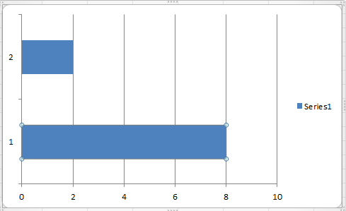
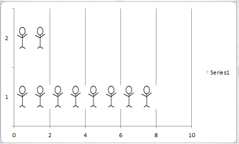
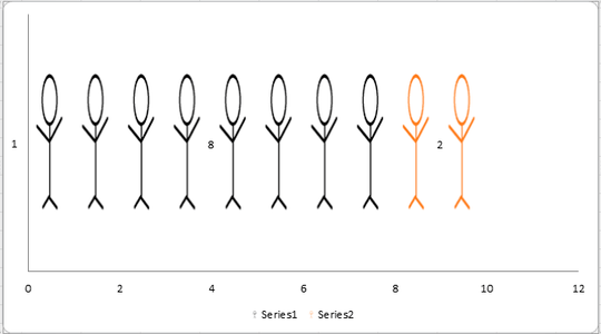
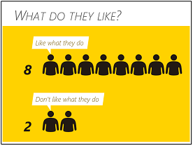
How could I make a chart similar to the one below?

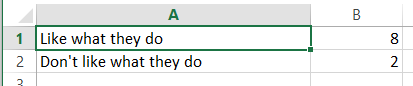
Of course, I could use an app like Microsoft Paint, but that would be too time-consuming and awkward. What would be a simple way to do this?

Miscreant
Posted 2013-12-01T16:34:34.587
Reputation: 363


4This type of chart is called a pictograph. – Rajib – 2013-12-01T17:47:55.933
1@Rajib or an Infographic is corporate speak. – Austin T French – 2013-12-01T19:56:00.657