12
4
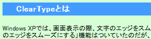
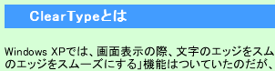
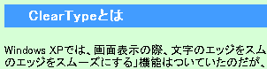
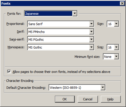
I am using Windows 7 and have set font smoothing to ClearType. However, Japanese characters display very roughly throughout the operating system. What can I do so they are rendered smoothly like other characters?
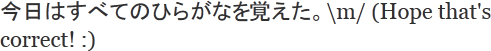
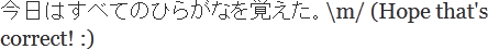
Here is a sample of what they currently look like:

missingfaktor
Posted 2012-03-13T06:08:13.283
Reputation: 564


by the way, it is not the "hiragana" that remembered something, it is you who remembered the hiragana. the correct phrase is "ひらがなを覚えた" – v.oddou – 2014-12-17T09:03:37.627
Are Japanese characters rendered roughly only in your web browser? If so, which browser are you using? – iglvzx – 2012-03-13T06:19:05.093
@iglvzx, I use Chrome. But the problem is not limited to Chrome. Wordpad, Word etc behave the same. – missingfaktor – 2012-03-13T06:27:05.833
Ok. Thanks for clarifying. I will add this information to your question. :) – iglvzx – 2012-03-13T06:27:55.223