Ring Menu
A Ring Menu (also known as a Pie Menu) is an interface element where a list of possible actions are displayed in a ring or circle, often centered around a character.
This type of menu is navigated in two general methods:
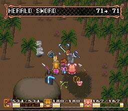
- Using the directional pad or buttons to rotate the menu like a wheel, with the item in the center being the one highlighted for use.
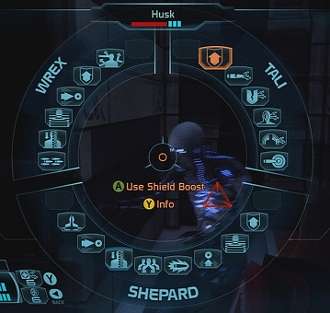
- Using an analog stick or mouse to "point" in the direction of the desired item, while the menu itself remains stationary.
A practical upshot of this format is that it can hide the fact that not all options are yet available to the player, since removing one option will not leave an empty space behind. The second type also has the advantage of being quicker than a traditional menu, sometimes quick enough to be accessed without having to pause the actual gameplay in progress.
Examples of Ring Menu include:
Type 1 - Spin the wheel
- The Secret of Mana series, if not the Ur Example, is likely the Trope Maker, using a ring menu system in almost every game of the series.
- Alien Soldier, although it doesn't pause the action.
- Metroid Prime 2 had a variation in which menu options were displayed emanating from a central node, and the user rotated the menu in three dimensions to bring one node to the front.
- The inventory from Escape from Monkey Island, in a variation similar to the one from Metroid Prime 2.
- Odin Sphere uses separate rings for each inventory pouch in the player's possession.
- Persona 3's battle menu.
- Secret of Evermore, which was built using the Mana game engine.
- Tomb Raiders 1, 2, 3, and Anniversary, for both its frontend and in-game menus.
- Wario Ware: Twisted!, with the variation that since the game cartridge featured a tilt sensor, you had to tilt the GBA itself to cycle through them.
- The inventory menus in Bayonetta are rings. Sub-menus, menus outside gameplay, and Rodin's inventory in the Gates of Hell are traditional linear menus.
- The first Grandia had this in its battle menu, going in one direction, left - right/right to left. The third game had this and would be able to go up - down/down-up as well in a sphere.
- Donkey Kong 64 has this in its primary menu screen.
- Golden Axe used this to select your play character.
Type 2 - Point to select

- America's Army 3
- First Arc the Lad had this in battles.
- A Boy and His Blob for the Wii
- The Battlefield series trademarked "Commo Rose" for voice communications, featured in Battlefield 2 Battlefield 2142.
- BioShock (series)
- Dragon Age
- The Legend of Zelda: Twilight Princess's used this for Link's inventory items specifically to avoid an Interface Spoiler—although it still provided a separate 'Quest Status' screen with a traditional layout.
- Mass Effect's abilities, as shown in the page image, are displayed like this.
- The Metroid Prime series used this to switch between Samus's visors and beam weapons. In the Game Cube originals they corresponded to the controller's directional pad and second analog stick respectively; Metroid Prime 3 (and the Trilogy edition) made this explicit by overlaying the menu across the game screen.
- Portal 2: In co-operative play, this is used to place markers indicating where your testing partner should look, place a portal, press a button and so on. Gestures are also selected this way.
- Ratchet and Clank series: Ratchet's quick-select menu (and Clank's action menu). Later games even expanded the menu to hold two or more 'pages' of items.
- Red Dead Redemption when selecting weapons.
- Resistance Fall of Man and Resistance 2
- Saints Row uses a type 2 with two such wheels: a larger one holding guns selected with the left stick, and a smaller one for food/drugs selected with the D-pad. The Third changes this slightly - the D-Pad now selects which grenade to throw, as food items were removed entirely and grenades do not need to be equipped like other weapons to be used.
- The player select screen in Matrimelee is this.
- The Wii versions of Trauma Center use the second type. The hand and bandage tools are removed (the Bandages are only used at the end of an operation, anyways) so that there are an even 8-points for directional tool switching. It takes a bit of getting used to, but it's probably easier to play the game this way than on the DS.
- Perfect Dark displayed your weapons and gadgets like this - optional for weapons, which you could just scroll through like most FPSes, but the only way to access things like night-vision.
- Sonny uses this in combat. You click on the target, at which point any useable options are highlighted (healing/buffs on Sonny or allies, attacks on enemies).
- Second Life used to have a few of those, but they are cranky. Now replaced with drop-down menus, that are crankier.
- Weapons and spells in Clive Barker's Undying.
- While the default interface in World of Warcraft doesn't have this feature, a popular add-on, OPie allows it to be applied in-game. It is a great tool to utilize sparsely used skills, items, macros, abilities, and other things while minimizing interface clutter.
- Rainbow Six Vegas and Vegas 2 have two such menus of this type. The first brings up the inventory menu for switching weapons and grenades/equipment. The second brings up options for your current gun, such as changing the rate of fire and attaching a suppressor.
- Psychic powers and items in Psychonauts.
Mixed or unsorted variations
- The three levels of magic in Bullet Witch are displayed in a ring setup. The size of the ring is inversely proportionate to the power of the magic you select.
- Common in later LucasArts Adventure Games.
- The Curse of Monkey Island, where the menu appeared as a coin.
- Noctropolis
- Isometric Game Boy Advance action game Scurge: Hive has one of these for weapon type selection, though it's basically just a circular version of a traditional menu since you can see the empty slots before they're filled.
- The Sims
- Turok 2 has two separate versions. One that consists of two rings, one for each activation button, and a massive ring that spins on one side of the screen, like the first game.
- the iPod game Song Summoner had this to match the clickwheel interface of the platform.
- Temple of Elemental Evil uses a radial menu that was basically a multi-tiered ring menu for each category, so "attack" has sub sections for attack modes (such as the option to deal non lethal damage) and attack types (such as trip and full attack) under it.
- Phantom Brave uses a ring menu for character creation. This gets a little annoying as you always start at the same spot in the ring each time and you eventually get enough generic character classes for two rings.
- Planescape: Torment replaced the standard Infinity Engine UI with one of these. It left something to be desired.
- Prototype features this as the primary way to switch abilities, though there is also a quick select feature for when you're in a hurry.
- Dungeons and Dragons Shadow Over Mystara as well as its prequel Tower of Doom had this. Spellcasters got more rings for spells.
- The FoxTab add-on for Firefox has an option for this.
- Rune Factory: Frontier uses separate ring menus for tools, seeds, and weaponry. You can even customize a ring menu to store the tools you use most frequently.
- The A-Trans menu in Mega Man ZX Advent is Type 2 in the Pause screen, and Type 1 when you access it via a preset button.
- In Drakengard, you choose your weapon from a ring of sharp objects.
- Hitman: Blood Money does this.
This article is issued from Allthetropes. The text is licensed under Creative Commons - Attribution - Sharealike. Additional terms may apply for the media files.
