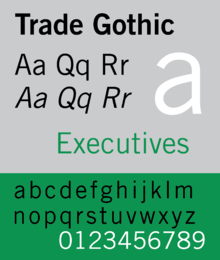
Trade Gothic
Trade Gothic is a sans-serif typeface first designed in 1948 by Jackson Burke (1908–1975), who continued to work on further style-weight combinations (eventually 14 in all) until 1960 while he was director of type development for Linotype in the USA. The family includes three weights and three widths.[1]
 | |
| Category | Sans-serif |
|---|---|
| Designer(s) | Jackson Burke |
| Foundry | Linotype |
| Date created | 1948 |
Like many gothic fonts of the nineteenth and early twentieth centuries, Trade Gothic is more irregular than many other sans-serif families that came later, especially later ones like Helvetica and Univers. This variety is often popular with designers who feel that it creates a more characterful effect. Its complex history has left it with several unexpected features: for instance in some digital releases the default bold weight is more condensed than the regular weight, the opposite of the norm, with a wider bold offered as an alternative.
Releases
Like many pre-digital fonts, cross-licensing has meant the original digitisation of Trade Gothic is available from a range of companies, including Adobe (14 styles) and Linotype (36).[2][3]
Trade Gothic Next
Released in February 2009 by Linotype, it is a redesign by Akira Kobayashi and Tom Grace. The most important change was to remove the inconsistencies found in the original family. Other reworked designs include terminals, stroke endings, the spacing, and the kerning.[4]
The family includes 17 fonts in four weights and three widths, with the fourth (Light) weight only in widest width fonts, and complementary italic in all but Compressed width fonts. It supports ISO-Adobe 2, Adobe CE, Latin Extended characters. OpenType features include sub/superscript, proportional lining figures. The extended width from original Trade Gothic was not included.[5] Linotype also released some styles with a rounded design.[6]
Trade Gothic Next Rounded (2009)
It is a version of Trade Gothic Next with rounded corners and terminals.
The family includes nine fonts in three weights (regular, bold, heavy) and three widths and one style (roman). OpenType features include numerators/denominators, fractions, standard/discretionary ligatures, localized forms, sub/superscript, proportional figures.
Trade Gothic Display (2017)
Designed by Lynne Yun of Monotype GmbH, this family is based on Trade Gothic Condensed Heavy, but with only capital glyphs for Latin texts. The different fonts can be used over each other in layers to create complex effects.[7]
The family include five fonts in one weight and one width, with five different styles inside glyph outlines. OpenType features include case-sensitive forms, numerators/denominators, fractions, standard ligatures, localized forms, sub/superscript, proportional/lining figures, glyph (de)composition, kerning, mark (to mark) positioning.
Usage
Since 2008, Trade Gothic is one of the key elements of the visual identity of Amnesty International. Trade Gothic is used both in the organization's logo and to typeset the body text of Amnesty's printed matter. The Arabic version of Amnesty's logo uses the Atrissi Al-Ghad font. Trade Gothic has also been heavily used in the Rapha cycling wear branding.
Vice often uses Trade Gothic along with Hector Rounded.[8]
Explaining why he often uses Trade Gothic in an article for HiLoBrow, designer Tony Leone wrote that Trade Gothic, especially its Bold Condensed weight, "is airy in its spacing — especially when set as text — which gives it its pleasing character...it plays well with others — that is, it combines nicely with more extravagant or decadent faces and can serve as a workhorse option with other sans serifs."[9]
See also
- News Gothic - ATF's competitor
- Benton Sans - a modern digital design in the same style but more unified
- Alternate Gothic - ATF's more condensed competitor
References
- Tselentis, Jason; Haley, Allan; Poulin, Richard; Tony Seddon; Gerry Leonidas; Ina Saltz; Kathryn Henderson; Tyler Alterman (2012-02-01). Typography, Referenced: A Comprehensive Visual Guide to the Language, History, and Practice of Typography. Rockport Publishers. p. 180. ISBN 9781592537020. Retrieved 4 December 2012.
- "Trade Gothic". MyFonts. Linotype. Retrieved 5 October 2015.
- "Trade Gothic (Adobe digitisation)". MyFonts. Adobe/Linotype. Retrieved 5 October 2015.
- More weights, more options. Linotype introduces Trade Gothic Next
- "Trade Gothic Next". MyFonts. Linotype. Retrieved 5 October 2015.
- "Trade Gothic Next Soft Rounded". MyFonts. Linotype. Retrieved 5 October 2015.
- Trade Gothic Display – new multi-layer styles for the popular design font
- 3EIGE and Vice staff (November 30, 2004). "The Vice A to Z of Design". Vice Media. Retrieved March 25, 2014.
- Leone, Tony. "Kern Your Enthusiasm". HiLoBrow. Retrieved 5 October 2015.
External links
- Monotype GmbH pages: Trade Gothic, Trade Gothic Next, Trade Gothic Next Soft Rounded, Trade Gothic Display
- MyFonts page on Trade Gothic Next
- Adobe digitisation
- News/Trade/Franklin Gothic alternatives - survey by Stephen Coles
- Luc Devroye on Trade Gothic