Theodore Low De Vinne
Theodore Low De Vinne (December 25, 1828 – February 16, 1914) was an American printer and scholarly author on typography. De Vinne did much for the improvement of American printing.
Theodore Low De Vinne | |
|---|---|
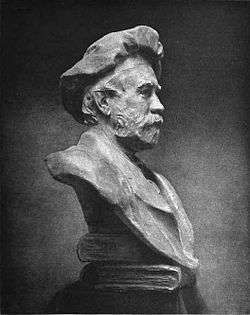
 Bust of Theodore Low De Vinne by Chester Beach | |
| Born | December 25, 1828 |
| Died | February 16, 1914 (aged 85) New York, NY |
| Occupation | Printer, typographer |
| Employer | De Vinne Press |
| Organization | Grolier Club |
| Parent(s) | Daniel De Vinné[1] and Joanna Augusta Low[2] |
Life and career

De Vinne was born at Stamford, Connecticut, and educated in the common schools of the various towns where his father, an itinerant Methodist mininister,[2] had pastorates. He learned the rudiments of printing while employed in a shop at Fishkill, New York. He worked at the Newburgh, New York Gazette, then moved to New York City. In 1850 he was hired as a compositor by the printing shop of Francis Hart in New York, where he rose to the position of foreman within a year, which included duties as shop manager.[3] He became a partner in Hart's business in 1858 and assumed sole proprietorship of the firm upon Hart's death in 1877, eventually renaming it to Theodore L. De Vinne & Co. in 1883.[4]
While still a partner of Hart's, De Vinne managed to steer the business from job printing to the more lucrative and prestigious book and periodical trade, mostly thanks to his excellence in printing wood engravings.[5] De Vinne's commercial success and high repute derived in large measure from the collaboration with his main client in this market segment, The Century Company, for whom he printed the popular St. Nicholas Magazine[6] and The Century Magazine,[7] as well as many books, such as George Kennan's influential Siberia and The Exile System,[8] as well as large multi-volume works such as The Century Dictionary[9][10] and John Nicolay and John Hay's authoritative biography of Abraham Lincoln.[11]
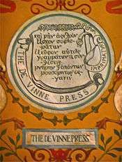
In 1886, with his business greatly expanded and seeking to increase its printing capacity, he moved the company to the De Vinne Press Building on Lafayette Place, a model plant designed by himself in collaboration with the architects Babb, Cook & Willard.[12][13] The building was designated a New York City landmark in 1966, and was added to the National Register of Historic Places in 1977.[14]
De Vinne either commissioned Linn Boyd Benton, or co-designed in conjunction with Benton, the still-popular Century Roman typeface for use by The Century Magazine.[15] For use at his own press, he also commissioned Linotype to produce De Vinne, an updated Elzevir (or French Oldstyle) type, and the Bruce Typefoundry to produce Renner, a Venetian face.[16] However, De Vinne's was not closely involved with the design of "De Vinne" and he ultimately was somewhat unhappy with the typeface.[17]
In 1865 De Vinne was a co-founder of the Typothetae, a trade organization of master printers, which was a predecessor of the Printing Industries of America.[18] He was also one of nine men who founded the Grolier Club in 1884,[19] and he was printer to the Club for the first two decades of its existence and designed and printed most of its publications during his lifetime.[20]
Works
De Vinne started his writing career at the age of thirty, as soon as he had become a partner in Hart's printing office.[21] A prolific author in the periodical printing trade press, he also wrote a number of books on the history and practice of printing. His books include:
- The printers’ Price List (1871),[22] an item-by-item list of pricing recommendations for job and book printing based on systematic cost accounting, designed to counteract the practice of underbidding among fellow printers.[23]
- The Invention of Printing (1876),[24] an investigation of the claims of Laurens Coster to be inventor of printing with movable type, and awarding the honor to Gutenberg
- Historic Printing Types (1886)[25]
- Plain Printing Types (1900)[26] (The Practice of Typography, vol. 1)
- Correct Composition (1901)[27] (The Practice of Typography, vol. 2), a leading style guide for compositors, proofreaders and authors.[28]
- A Treatise on Title-Pages (1902)[29] (The Practice of Typography, vol. 3), a revision of his earlier Title Pages as seen by a Printer,[30] published by the Grolier Club in 1901.[31]
- Modern Methods of Book Composition (1904)[32] (The Practice of Typography, vol. 4)
- Notable Printers of Italy during the Fifteenth Century (1910)[33]
References
- Irene Tichenor 2005, p. 5.
- Irene Tichenor 2005, p. 7.
- Irene Tichenor 2005, pp. 13–20.
- Irene Tichenor 2005, pp. 55–67.
- Irene Tichenor 2005, p. 32.
- Irene Tichenor 2005, p. 36–38.
- Irene Tichenor 2005, p. 106–112.
- John, Arthur (1981). The best years of the Century : Richard Watson Gilder, Scribner's monthly, and the Century Magazine, 1870–1909. Urbana: University of Illinois Press. pp. 130–132. Retrieved 2020-06-18.
- Allan Metcalf 1996, pp. 18–27.
- Irene Tichenor 2005, p. 90–92.
- Irene Tichenor 2005, p. 101.
- Dunlap, David W. (2014-02-19). "Celebrating a Building That Has Stood for Decades as a Symbol of the Press". The New York Times. New York. ISSN 0362-4331. Retrieved 2020-06-29.
- Irene Tichenor 2005, pp. 71–81.
- Gray, Christopher (April 13, 2003). "Streetscapes/De Vinne Press Building, Fourth and Lafayette Streets; An Understated Masterpiece That Earns Its Keep". The New York Times. Retrieved 2017-11-24.
- Irene Tichenor 2005, pp. 106–109.
- Mac MacGrew, "American Metal Typefaces of the Twentieth Century, Oak Knoll Books, New Castle Delaware, 1993. ISBN 0938768344
- Irene Tichenor 2005, pp. 125–126.
- Irene Tichenor 2005, pp. 24–26.
- Irene Tichenor 2005, pp. 68–70.
- "The De Vinne Centennial". American Printing History Association. 2014-02-16. Retrieved 2016-12-07.
- Irene Tichenor 2005, p. 23.
- De Vinne, Theodore Low (1871). The printers’ Price List A manual for the Use of Clerks and Book-Keepers in Job Printing Offices. New York: Francis Hart & Co.
- Irene Tichenor 2005, pp. 23–26.
- De Vinne, Theodore Low (1876). The Invention of Printing: A Collection of Facts and Opinions. New York: F. Hart & Co. Retrieved 2020-06-25.
- De Vinne, Theodore Low (1886). Historic Printing Types. New York: De Vinne Press.
- De Vinne, Theodore Low (1900). Plain Printing Types. The Practice of Typography. New York: The Century Co.
- De Vinne, Theodore Low (1901). Correct Composition. The Practice of Typography. New York: The Century Co.
- Irene Tichenor 2005, p. 138.
- De Vinne, Theodore Low (1902). A Treatise on Title-Pages. The Practice of Typography. New York: The Century Co.
- De Vinne, Theodore Low (1901). Title Pages As Seen By A Printer. New York: The Grolier Club. Retrieved 2020-07-07.
- Irene Tichenor 2005, p. 139.
- De Vinne, Theodore Low (1904). Modern Methods of Book Composition. The Practice of Typography. New York: The Century Co.
- De Vinne, Theodore Low (1910). Notable printers of Italy during the fifteenth century. New York: The Grolier Club.
Sources
- Metcalf, Allan (1996). "Typography". Dictionaries: Journal of the Dictionary Society of North America. 17 (1): 17–28. doi:10.1353/dic.1996.0018. ISSN 2160-5076. Retrieved 2020-07-02.
- Tichenor, Irene (2005). No Art Without Craft: The Life of Theodore Low De Vinne, Printer. Boston: David R. Godine. ISBN 978-1-56792-286-8.CS1 maint: ref=harv (link)
External links
| Wikisource has original works written by or about: Theodore Low De Vinne |
- Works by Theodore Low De Vinne at Project Gutenberg
- Works by or about Theodore Low De Vinne at Internet Archive