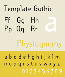
Template Gothic
Template Gothic is an experimental, sans-serif typeface designed by Barry Deck in 1989.[1][2] It was not commercially released until type designer Rudy VanderLans was exposed to the font, when Deck's California Institute of the Arts graduate class visited his studio.[3] In 1991, it was released by Emigre, a type foundry, of which VanderLans was a co-founder. In 1992, Deck developed a serif variation of the font. Template Gothic is considered one of the most defining fonts of the 1990s grunge aesthetic.
 | |
| Category | Sans-serif |
|---|---|
| Designer(s) | Barry Deck |
| Foundry | Emigre |
| Date created | 1989 |
| Date released | 1991 |
History
Deck designed Template Gothic while studying at California Institute of the Arts under artist and graphic designer Edward Fella. Deck chose to eschew the predictability and uniformity of typefaces such as Helvetica and Univers, paying more attention to organic shapes and natural variations in order to create a more imperfect look.
In an interview with Emigre, Deck describes how he received the inspiration for Template Gothic from a sign in his local laundromat, which had been lettered by hand with a template.
There was a sign in the laundromat where I do my laundry. The sign was done with lettering templates and it was exquisite. It had obviously been done by someone who was totally naive. A few months ago, it was replaced with a plastic sign painted by a skilled sign painter. I asked them if I could have the old sign, and they gladly handed it over to me. Now it's on the wall in my bedroom. I was inspired to design a face that looked as if it had suffered the distortive ravages of photomechanical reproduction. The resulting Template Gothic typeface reflects my interest in type that is not perfect; type that reflects more truly the imperfect language of an imperfect world, inhabited by imperfect beings.[4]
Usage
It was used in posters and promotional material of the 1993 popular coming-of-age comedy film Dazed and Confused. It was also notably used on the posters and advertising material of other films such as 1994's Reality Bites and 1998's The Negotiator.
It was featured prominently in Issue #19 of Emigre, designed by Rudy VanderLans, in the cover art as well as inside the magazine.
It was also used in the logo for Top of the Pops from 1995 to 1998.
Template Gothic was one of the first digital typefaces acquired by the Museum of Modern Art for its Architecture and Design Collection in 2011. Along with twenty-two other fonts, it was displayed in MoMA's Standard Deviations exhibition from March 2011 to January 2012.[5]
References
- Dooley, Michael. "An Interview With Edward Fella". Emigre. Retrieved 23 December 2013.
- "Template Gothic". Barry Deck.
- "Rudy VanderLans". Speak Up.
- "Template Gothic". Emigre. Retrieved 23 December 2013.
- "Exhibitions". Standard Deviations: Types and Families in Contemporary Design. The Museum of Modern Art. Retrieved 23 December 2013.