Sendai Mediatheque
Sendai Mediatheque is a library in Sendai, Miyagi Prefecture, Japan. It was designed by Toyo Ito in 1995 and completed in 2001.
| Sendai Mediatheque | |
|---|---|
 | |

| |
| General information | |
| Type | Library |
| Town or city | Sendai |
| Country | Japan |
| Construction started | 17 December 1997 |
| Completed | 10 August 2000 |
| Opened | 26 January 2001 |
| Cost | ca. 13 billion yen |
| Height | 36.49 m |
| Technical details | |
| Structural system | steel-ribbed with partial reinforced concrete |
| Floor area | 21,682 m² |
| Design and construction | |
| Architect | Toyo Ito |
| References | |
| [1] | |
History
The Sendai Mediatheque held its official opening on January 2001.
Ito also refers to Mies' Barcelona Pavilion and Le Corbusier’s Dom-ino house as precedents for his work, and indeed, the Mediatheque appears to mix concepts from the two projects, combining le Corbusier’s play with slab and column structure, with Mies “fluid” spatial effects achieved through combined transparency and reflectivity of materials.
Location
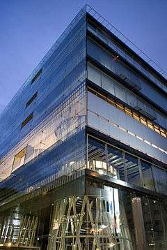
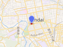
The Sendai Mediatheque is located in the heart of the city of Sendai, only a few blocks away from the city hall. The building sits flush with Jozenji street, a six-lane divided boulevard, although there are entrances on all four sides of the building.[2] The diaphanous glass and metal façade of the institution, while differing from the mainly white, opaque volumes of the neighboring buildings, blends harmoniously with the environment during the daytime due to its reflectivity, while at night the interior lighting scheme transforms the volume into a multi-hued lantern. The ground floor is conceived as an extension of the street, with a cafe, bookstore, and event plaza sitting freely (without partitions) within the ground floor space, with views to the sidewalk through the double-glazed facade facing Jozenji Street.
This extension of the city into the building continues throughout all seven floors above ground; a gesture which reinforces Ito's resistance to the rigid limitation of activities in the building to within predetermined areas.
...this building has many free spaces, that is, spaces that are not intended, as rooms are, to serve specific functions. Such spaces exist, for example, between the tubes and the building perimeter. Visitors will be able to use such spaces as they use the city streets, for various activities. ... I am hoping that, as such spaces are used, the Mediatheque will become a place for thinking about the city.
— Toyo Ito (2001), [3]
The building

The Sendai Mediatheque is a mixed-program public facility which combines library and art gallery functions located in the city of Sendai, Japan. Toyo Ito's winning entry for an open competition commissioned by the city of Sendai in 1995, the innovative building opened to the public in January 2001.[4] The Mediatheque's seven levels of facilities offer a range of services including a conventional book-lending library, an extensive collection of film and audio recordings with stations for both viewing and editing, a theater, to a cafe and bookstore, all housed in a nearly cubic glass enclosure.[4] The seven platforms are supported by what Ito calls "characterizing" architectural elements:[4] a forest of 13 non-uniform tubes which appear to rise fluidly through the building. Architecturally, the building is considered an important milestone in Ito's career.[5]
"In terms of architectural genre the Sendai Mediatheque was a pioneering example of attempts to use new notions of 'media' as an architectural concept."[6]
This project's importance is derived from its poetic imagery, avant-garde program and technical innovation. In Ito's own words:
Sendai Mediatheque embodies our proposal for a completely new concept of architecture. ...The complex includes a Mediatheque, an art gallery, a library, an information service center for people with visual and hearing impairments and a visual image media center. During the open competition and subsequent phase of basic designing, our primary effort was on demolishing the archetypal ideas of an art museum or library to reconstruct a new idea of architecture called "mediatheque" utilizing the state-of-the-art media.
— Toyo Ito, [7]
Structure
- First floor: Cafe, shop, information desk, “open square” multi-purpose event venue
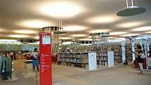
- Second floor: Multimedia library, children's library, inquiries for sight and hearing impaired, meeting room, current newspapers and magazines
- Third Floor: Library
- Fourth Floor: Library mezzanine
- Fifth Floor: Public gallery spaces
- Sixth Floor: Professional gallery/exhibition space
- Seventh floor: Cinema, studio spaces, meeting rooms, administration offices
Organization
Ito, in creating the Sendai Mediatheque, acknowledged that it would be an institution devoted to accommodating changing technologies. While the design of the Mediatheque is meant to encourage a flexibility of use through the blurring of boundaries found in traditional library and museum typologies, Ito resists the characterization of the space inside the center as the “homogenous” or "universal" space of modernism.
"The Sendai Mediatheque has been constantly changing from the beginning. However, it differs from universal space in that there is considerable variation depending on where you are in the building. For example, the spaces to the South and to the North are quite distinct because of the quality of light and wall surfaces, so their uses are determined by the given spatial conditions to some degree - although quite loosely, of course. Basically, universal space implies the possibility of doing anything anywhere in a homogeneous environment. Sendai is very different."
Indeed, reinforcing the subtle differences in spatial composition provided by the tubes, each level's ceiling height and design, partition material and lighting colors reinforce the differentiation in uses to create space which could not fairly be described as homogeneous. Perhaps most striking, however, is the differentiation between levels is the furniture designed by several different designers which through color, style, and layout becomes one of the most prominent identifying features of a particular floor.
Materials
The structure of the Sendai Mediatheque is composed of three main elements: tubes, plates and skin.
The plates (floor slabs) are composed of a honeycomb-like network of steel sections infilled with lightweight concrete. The steel honeycomb structure allows the plate to span between irregularly spaced vertical supports without beams, and with minimal thickness of the slab itself. Each floor hosts a different set of the building's many facilities which are more or less free to interact with each other over the surface of a given plate.
The skin, or facade treatment differs on all five exposed sides of the building, modulating light and views, creating a uniformity across each face of the cube during the day. The main (south-facing) facade is double-glazed and functions as part of the building's climate control system. The materials which compose the skin are glass, steel panels, and aluminum mesh.
The most striking structural elements are the tubes, composed of thick-walled steel pipes; they range in size from 7 to 30 inches In diameter. Although they appear to be continuous, the tubes were actually manufactured in floor-height segments and were assembled sequentially, floor-by-floor. The tubes perform a number of functions. Firstly, they serve to structurally support the building. The four tubes closest to the outer corners of the plates were designed to resist a 400-year earthquake, while the others resist the vertical gravity loads. As a test to its integrity, the building survived the March 2011 earthquake with little to no damage.
The tubes also house vertical circulation of air, water, electricity, light and people within the building. The constant motion of people through the stairs and elevators, as well as the glow of light passing through these tubes creates a perceptual link between the floors, and the functions they house, which might otherwise have felt isolated from one another. Because the tubes create links throughout the full height of the building, they are often glazed to provide fire protection between floors.
In the plane of a specific floor, the non-standard layout loosely manipulates the layout of the floor plan. The size of each tube is determined by its internal function – stairs, elevator, light shaft. Moreover, since the exact dimensions of the tubes vary from floor to floor, this variation, along with differentiation in the lighting colors between floors, adds a distinctive character to each level. Structure becomes ornamentation.
See also
References
- Sendai Mediatheque: About Sendai Mediatheque Archived 2010-12-21 at the Wayback Machine, accessed February 28, 2011
- N.R. Pollock; Toyo Ito & Associates. Mediatheque, Sendai, Japan. Architectural Record, 189, Part 5 (2001): 190.
- Toyo Ito. Hiroshi Wanatabi, Trans. Lessons of the Sendai Mediatheque. Japan Architect, 41 (2001): 7
- Designboom: Toyo Ito, Interview. Vicennza, October 25, 2001, accessed February 28, 2011
- Toyo Ito: The New Real Architecture Exhibition, Tokyo. El Croquis. Sendai Mediatheque. El Croquis. No. 123, (2005): 14
- Akira Suzuki. Smt 2.0 – Upgrading the Sendai Mediatheque to Produce an Archive for the Folksonomy Era. VOLUME, 15, (2008): 66-69.
- Toyo Ito: Image of Architecture in Electronic Age. Interview Statement, Designboom, accessed February 28, 2011
External links
| Wikimedia Commons has media related to Sendai Mediatheque. |
- Official site (in English)