Em (typography)
An em is a unit in the field of typography, equal to the currently specified point size. For example, one em in a 16-point typeface is 16 points. Therefore, this unit is the same for all typefaces at a given point size.[1]
| Look up em, Em, em dash, or M in Wiktionary, the free dictionary. |
The em dash (—) and em space ( ) are each one em wide.
Typographic measurements using this unit are frequently expressed in decimal notation (e.g., 0.7 em) or as fractions of 100 or 1000 (e.g., 70/100 em or 700/1000 em). The name em was originally a reference to the width of the capital M in the typeface and size being used, which was often the same as the point size.[2]
History

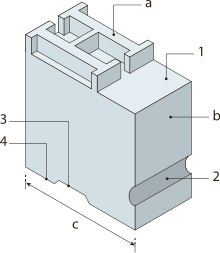
In metal type, the point size (and hence the em) was equal to the line height of the metal body from which the letter rises. In metal type, the physical size of a letter could not normally exceed the em.
In digital type, the em is a grid of arbitrary resolution that is used as the design space of a digital font. Imaging systems, whether for screen or for print, work by scaling the em to a specified point size.
In digital type, the relationship of the height of particular letters to the em is arbitrarily set by the typeface designer. However, as a very rough guideline, an "average" font might have a cap height of 70% of the em, and an x-height of 48% of the em.[3]
Incorrect and alternative definitions

Although the size of the em ultimately depends on the point size, or height of the metal body of a letter, it is also used as a measure of horizontal spacing relative to the type size, with vertical spacing being measured in picas or points.[1] One em was traditionally defined as the width of the capital M in the current typeface and point size,[2] because the M was commonly cast the full-width of the square blocks, or em-quads (also mutton-quads), which are used in printing presses.
In modern typefaces, the character M is usually somewhat less than one em wide. Moreover, as type includes a wider variety of languages and character sets than just those based on Latin, and needs a consistent way to refer to size, its meaning evolved long ago; this allowed it to include fonts, typefaces, and character sets which do not include a capital M, such as Chinese and Arabic. Because of how digital type works, the em now always means the point size of the font in question.
CSS
In Cascading Style Sheets, the em unit is the height of the font in nominal points or inches. The actual, physical height of any given portion of the font depends on the user-defined DPI setting, current element font-size, and the particular font being used.
To make style rules that depend only on the default font size, another unit was developed: the rem. The rem, or root em, is the font size of the root element of the document. Unlike the em, which may be different for each element, the rem is constant throughout the document.[4]
See also
- Em dash (—)
- En (typography)
- Fullwidth forms
- List of XML and HTML character entity references
- Non-breaking space width variations
- Pixels-per-em (PPEm) – Used in operating systems to describe the allotment of pixels to em height
- Responsive web design
References
- Bringhurst, Robert (1992). The Elements of Typographic Style. Vancouver, BC: Hartley & Marks. pp. 25–26. ISBN 978-0-88179-033-7. OCLC 25411784.
- This is the traditional definition shown in the Adobe Glossary and the Pocket Oxford Dictionary Third revised edition 1996.
- Phinney, Thomas (March 18, 2011). "Point Size and the Em Square: Not What People Think". Retrieved 2014-10-20.
- "W3C. CSS: em, px, pt, cm, in…".