Chord diagram
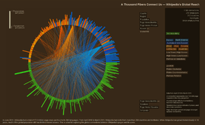
A chord diagram is a graphical method of displaying the inter-relationships between data in a matrix. The data are arranged radially around a circle with the relationships between the data points typically drawn as arcs connecting the data.

The format can be aesthetically pleasing, making it a popular choice in the world of data visualization.
The primary use of chord diagrams is to show the flows or connections between several entities (called nodes). Each entity is represented by a fragment (often colored or pattered) along the circumference of the circle. Arcs are drawn between entities to show flows (and exchanges in economics). The thickness of the arc is proportional to the significance of the flow.
Name
Chord diagrams get their name from terminology used in geometry. A chord of a circle is a geometric line segment whose endpoints both lie on the circle. Chord diagrams are also known as radial network diagrams and may sometimes be referred to as a type of circular layout.
Hierarchical edge bundling
While a small amount of data could be represented in a circular diagram using straight lines to show the interconnections, a diagram featuring numerous lines would quickly become illegible. To reduce the visual complexity, chord diagrams employ a technique called hierarchical edge bundling.[1][2]
Common Usages
Chord diagrams are useful for showing relationships between entities and their relative magnitudes in comparison to alternative arcs. As a result, chord diagrams are popular in migration studies, economic flows, and genome studies.
References
- Holten, Danny (September–October 2006). "Hierarchical Edge Bundles: Visualization of Adjacency Relations in Hierarchical Data" (PDF). IEEE Transactions on Visualization and Computer Graphics. IEEE Computer Society. 12 (5). ISSN 1077-2626.
- "CHORD DIAGRAM".
External links
- Hierarchical Edge Bundling is the technique by which the lines that connect nodes are grouped together to reduce visual clutter.