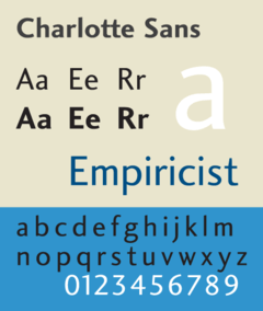
Charlotte Sans
Charlotte Sans is a humanist sans-serif typeface designed by Michael Gills in 1992 as part of a larger family called Charlotte, which includes a related serif text face. The face was designed for Letraset.
 | |
| Category | Sans-serif |
|---|---|
| Classification | Humanist sans-serif |
| Designer(s) | Michael Gills |
| Foundry | Letraset |
| Date released | 1992 |
Charlotte Sans bears comparison with Eric Gill's 1927 face Gill Sans, sharing several humanist sans-serif characteristics: a double-story roman a and g, and a single-story lowercase italic a. Charlotte Sans has a tapered glyphic stroke in the t. Terminals in vertical strokes are not parallel to the baseline but instead cut at an angle. Similarities can be seen with Syntax and FF Scala Sans. The overall stroke width is varied, and rhythmic is seen especially in the serif version of the face, which was inspired by the types of 18th-century punch-cutter Pierre-Simon Fournier.
References
- Friedl, Frederich, Nicholas Ott and Bernard Stein. Typography: An Encyclopedic Survey of Type Design and Techniques Through History. Black Dog & Leventhal: 1998. ISBN 1-57912-023-7.
- Macmillan, Neil. An A–Z of Type Designers. Yale University Press: 2006. ISBN 0-300-11151-7.