Blue only mode
Blue Only mode is a special display mode on display units such as projectors and television sets whereby only the blue pixels or the blue cathode ray tube is used to generate the image.
Displays featuring this mode are prominent especially in the broadcast area because it allows for hue and saturation to be adjusted quickly and accurately. Professional monitors may feature a dedicated button on the front of the display to activate blue only mode.
Test images for Blue Only Mode
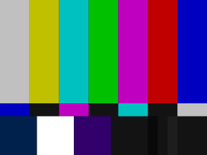

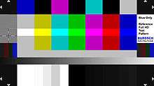
In general, all test pattern with a color bar, that includes red, green, blue, and the complementary colors cyan, magenta and yellow can be used to adjust hue and saturation in blue only mode. Particularly often the SMPTE test pattern or the HD version of the SMPTE is used for hue and saturation adjustment. These are in many cases already integrated in the recording and playback devices in the professional sector and are always available. Also the Blue Only-test image of the company Burosch audio video technology is suitable for use with a blue filter foil or just the Blue Only mode of a display. In addition to hue and saturation adjustment, it's possible to even adjust brightness, contrast and to check the transmission path with the burosch test. The above-mentioned test pattern from the Burosch company represents an update of the traditional HD SMPTE test pattern, with additional test zones for complete image control and optimization.
How the Blue Only Mode works
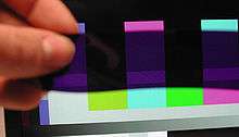
In Blue Only mode only the blue pixels of a display render the picture on the screen - or, for CRT displays, the blue cathode ray tube. Thus we see only the blue channel of the image, but rather blue tinted than black and white. Areas with blue color in it appear bright and those without blue color appear dark or black. A blue color with RGB values of 0 0 255 therefore appears bright. A red area (255 0 0) or a green surface (0 255 0) appears black. Below - or in some test images above - the color bars are reference areas, that serve as an indication for a proper adjustment. Because the reference areas have the same brightness value as the colored bars. If the display is properly adjusted, in the Blue Only Mode the colored areas blend perfectly into the reference areas, without a visible luminance difference. In the HD SMPTE test pattern, the reference area is located below the color bar in the form of a gray continuous surface (white with 75% luminance). In the old NTSC SMPTE test pattern, the reference area is also located under each color bar, but colored differently. The Blue Only-test image of the company Burosch has reference areas above and below the color bars. The following table shows the different colors in the test pattern, the corresponding code values and the visual impression with activates Blue Only Mode:
| Color | R G B - values (8 bit) 75% brightness | Brightness impression with Blue Only Mode ON |
|---|---|---|
| Red | 191 0 0 | Dark (Black) |
| Green | 0 191 0 | Dark (Black) |
| Blue | 0 0 191 | Bright |
| Cyan | 0 191 191 | Bright |
| Magenta | 191 0 191 | Bright |
| Yellow | 191 191 0 | Dark (Black) |
| 75% white | 191 191 191 | Bright |
| Black | 0 0 0 | Dark (Black) |
| 75% white reference area | 191 191 191 | Bright |
Adjusting saturation and hue
These must be the display device in the Blue Only mode enable. If this is not possible, you can - as mentioned above - rely on blue filter screens.
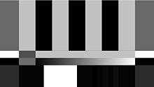
- First, to set the saturation. These changes to the value in the menu until the colored bars to show seamlessly, with the same brightness and no apparent difference in the reference areas or below the color bar.
- If the color bars are not different from the reference surfaces, is the saturation set correctly.
- The next one is now the color correctly.
Often raise individual colored areas is still subject to the reference areas, or individual colored bars - which actually would appear to be dark - too bright, stand out from the reference surfaces. This is particularly frequent the bars cyan and magenta, with less than but also the green color bar. In this case, the color is so long in the menu, adjust until these color bars are perfect and show no apparent difference in the reference area. In the links to find more detailed instructions.