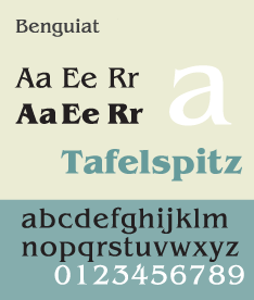
ITC Benguiat
ITC Benguiat is a decorative serif typeface designed by Ed Benguiat and released by the International Typeface Corporation (ITC) in 1977. The face is loosely based upon typefaces of the Art Nouveau period but is not considered an academic revival. The face follows ITC's design formulary of an extremely high x-height, combined with multiple widths and weights.
 | |
| Category | Serif |
|---|---|
| Classification | Display |
| Designer(s) | Ed Benguiat |
| Foundry | International Typeface Corporation |
| Date created | 1977[1][2] |
The original version of 1977 contained numerous nonstandard ligatures (such as AB, AE, AH, AK, AR, LA, SS, TT) and alternate shapes for some letters which were not carried into the digital version.[3]
The font family consists of 3 weights at 2 widths each, with complementary italic.
It is also sold as 'Formal 832' by Bitstream.
ITC Benguiat Pro
It is a version released in September 2008. It includes support for Central European and many Eastern European characters.
ITC Benguiat Gothic
 | |
| Category | Sans-serif |
|---|---|
| Classification | Humanist |
| Designer(s) | Ed Benguiat |
| Foundry | International Typeface Corporation (ITC) |
| Date created | 1979[4] |
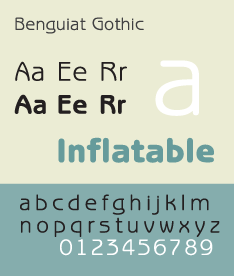
ITC Benguiat Gothic is a sans-serif variant for the original serif font family. Both faces are loosely based upon typefaces of the Art Nouveau period but are not considered academic revivals. The face follows ITC's design formulary of an extremely high x-height, combined with multiple widths and weights.
The font family consists of 4 weights at 1 width each, with complementary italic.
It is also sold as 'Informal 851' by Bitstream.
Use in popular culture
The font is used on the cover of 1980s Stephen King novels, The Smiths album Strangeways, Here We Come, for the book covers of the Choose Your Own Adventure series, The Bitmap Brothers game The Chaos Engine, as well as in the logos of both the National Assembly of Quebec and the Melbourne Knights.[5] The typeface is featured in the main titles of the Star Trek films, Star Trek Generations and Star Trek: First Contact, as well as video game Nier: Automata. Paramount's FBI warning, from 1995–present, also uses ITC Benguiat.[6] The font is also used in the logo of the American rock band Greta Van Fleet, in the logo for Netflix show Stranger Things, and in the album art for rapper Logic's album Supermarket. The font is used for the logo written and directed by Quentin Tarantino in the beginning of his films.
ITC Benguiat Gothic is also featured in The Sims 2 PC video game.
References
- "ITC Benguiat Gothic Medium". Identifont. Retrieved 22 November 2009.
- "ITC Benguiat". MyFonts. 3 December 2007. Retrieved 22 November 2009.
- Coles, Stephen (27 July 2016). "Photo-Lettering ITC Benguiat ad". Fonts in use. Retrieved 27 July 2016.
- "ITC Benguiat Gothic". MyFonts. 3 December 2007. Retrieved 22 November 2009.
Following up on his earlier serif design, Ed Benguiat created ITC Benguiat Gothic in 1979.
- "Choose Your Own Adventure book series". 27 July 2016. Retrieved 29 July 2016.
- "A History of Star Trek Movie Titles". TrekMovie.com. 15 March 2009. Retrieved 16 February 2014.
- Lawrence W Wallis. Modern Encyclopedia of Typefaces 1960–90. Lund Humphries Publishers Ltd: 2000. ISBN 0-85331-567-1.
- Friedl, Frederich, Nicholas Ott and Bernard Stein. Typography: An Encyclopedic Survey of Type Design and Techniques Through History. Black Dog & Leventhal: 1998. ISBN 1-57912-023-7.
- Macmillan, Neil. An A–Z of Type Designers. Yale University Press: 2006. ISBN 0-300-11151-7.
External links
| Wikimedia Commons has media related to ITC Benguiat Gothic. |