36
31
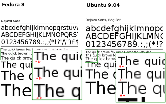
I'm switching from Fedora 8 to Ubuntu 9.04, and I can't seem to get it to get a good font anti-aliasing to work. It seems that Ubuntu's fontconfig tries to keep characters in integral pixel widths. This makes text more difficult to read, when 1 pixel is too thin and 2 pixels is too thick.
Check the image below. In Fedora, when fontconfig anti-aliasing is enabled, fonts have their thickness proportional to the font size. Below, the thickness is different for 8, 9 and 10pt sizes. In Ubuntu, on the other hand, even when anti-aliasing is enabled, all 8, 9 and 10pt sizes have 1 pixel thickness. This makes reading larges amount of text difficult.
I'm using the very same home directory, and I already checked that X resources are the same in both systems:
~% xrdb -query | grep Xft
Xft.antialias:  1
Xft.dpi:        96
Xft.hinting:    1
Xft.hintstyle:  hintfull
Xft.rgba:       none
GNOME settings:
~% gconftool-2 -a /desktop/gnome/font_rendering
 antialiasing = grayscale
 hinting = full
 dpi = 96
 rgba_order = rgb
So, the question is: What should I change in the new box (Ubuntu) in order to get anti-aliasing like in the old box (Fedora)?

Juliano
Posted 2009-07-19T23:22:23.070
Reputation: 2 492


8Is it just me who thinks that the Ubuntu fonts are much sharper and readable than the Fedora fonts? The Fedora fonts look way too blurry IMHO. – Yaba – 2010-08-12T10:02:54.373
I actually like the one on the right more. The one on the left is way too blurry. To each his own, though. ;) – Sasha Chedygov – 2010-08-12T10:03:11.977
@Yaba: Obviously not... You beat me by 17 seconds. :) – Sasha Chedygov – 2010-08-12T10:04:01.327
1@Yaba, @musicfreak: If you have CRT monitors or have a low resolution, the ones on the left may look too blurry. Otherwise, they better reflect the size of the font. Look at how the thickness of the lines in the right image suddenly jump from 1px to 3px as you increase the font size. This is also bad when it is being projected. The text doesn't become more readable as you increase the font size until it is too big (when it jumps to 3px). – Juliano – 2010-08-12T13:44:43.813
1Also, in the Ubuntu sample, look at how there is a missing pixel in the "k" in "quick" in the third text line, making it look like it was two glyphs, a "|" and a "<". – Juliano – 2010-08-12T13:49:02.853
2@Juliano
Then I have the first available Laptop with a built in CRT monitor :-) – Yaba – 2010-08-20T17:24:37.757