5
1
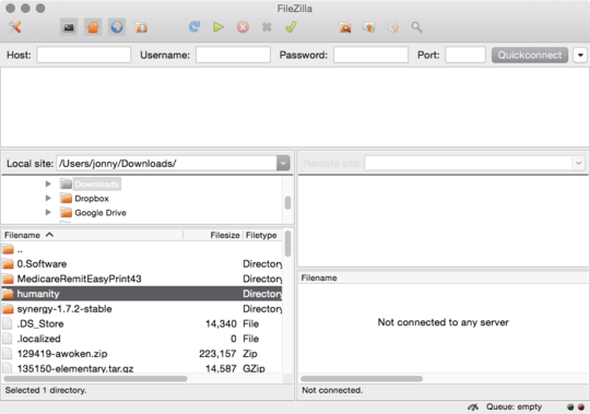
This is petty, I know. But Filezilla is so much nicer looking on Linux and Mac OS, and I presume it's due to the nasty Windows Redmondish inset dividers that are just there in the OS.
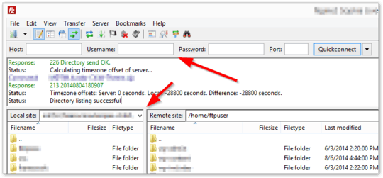
Is there any way to change Filezilla's UI to use a different "skin", or even to put it on GTK, in Windows 8.x?
On my system (Windows 8.1):
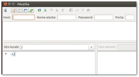
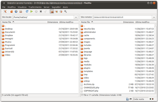
On a GTK environment (Ubuntu):
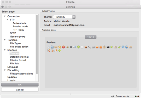
Thank you for the information, but I don't really care about the icons. It's the window dividers and style that are the offender. I presume that's not GTK by default, since Filezilla isn't a GTK app, like Pidgin or others ported from Linux to Windows. – Garrett – 2014-11-13T00:18:19.383
Hm... in Win 8.1 you can decrease the
BorderWidthandPaddedBorderWidthregistry key values to 0 inregedit-HKEY_CURRENT_USER\Control Panel\Desktop\WindowMetrics. That should help the situation somewhat (well, it will decrease the thick external border for all apps anyway). – Criveti Mihai – 2014-11-13T07:08:20.473