0
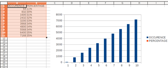
I have some data:
OCCURENCE   PERCENTAGE
64  11%
832 30%
1600    31%
2432    32%
3200    33%
3968    34%
4800    34%
5568    34%
6400    35%
7168    35%
But when I mark them and click on the diagram and finish, this is what I get:
But I need kinda this:
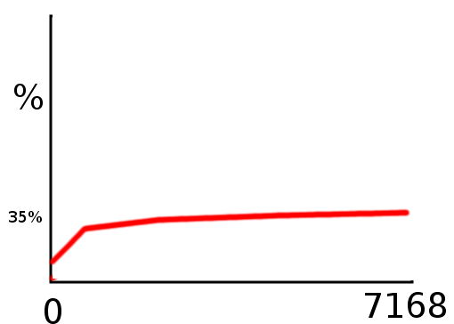
How do I create a diagram from my table that looks like the diagram that I need? I just can't figure it out!

thequestionthequestion
Posted 2014-10-13T13:36:43.433
Reputation: 101
You have to select the right type of chart, and then put A on the horizontal and B on the vertical axis. – Nattgew – 2014-10-13T19:12:13.667
can you plese explain exactly how? :O – thequestionthequestion – 2014-10-14T06:03:47.623
There are plenty of resources out there for making a line graph in OpenOffice
– Nattgew – 2014-10-14T14:47:59.720No, it doesn't work for my example! :\ – thequestionthequestion – 2014-10-15T08:33:25.173