Late to this party, but here's my suggestion.
First, some semantics. In a horizontal bar chart, the independent variable (X) is the vertical axis, and the dependent variable (Y) is the horizontal axis.
Here is a data range with depth in the first column, density in the second, and compositions of three constituents in the third through fifth. Note the blank cell where the "depth" label would be.
Step 1 - Select the data, insert a horizontal bar chart. When you leave the top left cell blank, Excel knows the first row and column are special, and uses one for X values (category labels) and the other for series names. With more rows than columns, it creates more categories than series, which is what we want.
Step 2 - Assign all of the Comp series to the secondary axis.
Step 3 - Change any one of the Comp series to stacked bar, all series on its axis (secondary in this case) will also change. Density bars are hidden behind the stacks.
Step 4 - Show the secondary Vertical Axis (Plus icon beside the chart in Excel 2013, Chart Tools > Layout tab otherwise).
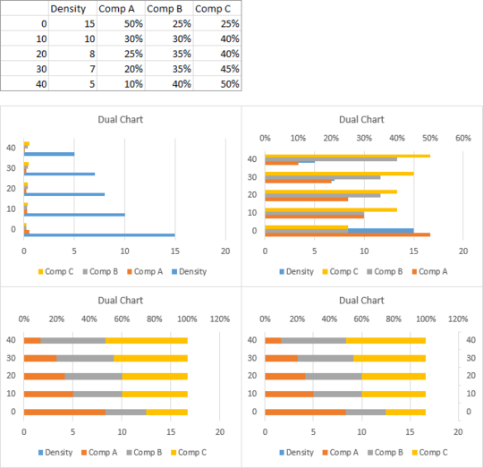
Step 5 - Format the primary (left) vertical axis so its categories are in reverse order.
Step 6 - Repeat for secondary (right) vertical axis.
Step 7 - Format primary (top) horizontal axis: minimum 0, maximum 40 (twice what we need), apply custom number format to the labels:
[<=20]0;;;
This means if the values are less than or equal to 20, use a number format of 0 (Number with no decimal digits), otherwise don't show the values.
Step 8 - Format the secondary (bottom) horizontal axis: minimum -1, maximum 1, number format of
0%;;0%;
This means, for positive numbers, use 0% (percentage with no decimal digits), don't show negative numbers, for zero also use 0%, and don't show text.
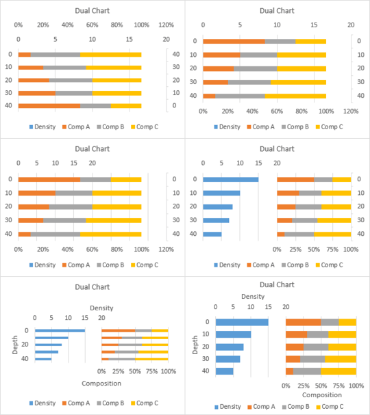
Step 9 - Add axis labels for both horizontal axes and primary (left) vertical axis. Format secondary (right) vertical axis so there are no labels and no tick marks.
Step 10 - Move the chart title, legend, and axis titles towards the edges of the chart. Center the horizontal axis labels over their respective halves of the chart. Enlarge the plot area (the data-containing inner part of the chart) to fill the space.


Can you post a link to a sample? – dav – 2014-04-15T12:05:46.327