3
2
I have a dataset containing values from 0 to 584. I would like to illustrate this using data bars, but I would like the databars to be green when the number is greater than 150, and red when the number is equal or less than 150.
Consider:

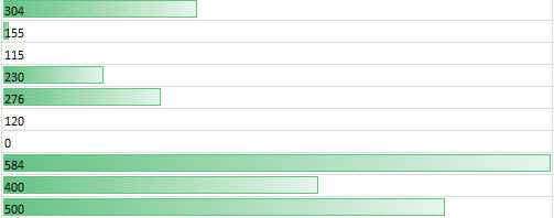
The green bars illustrate the relative values, but I cannot get RED bars on the chart concurrently.
Further consider:

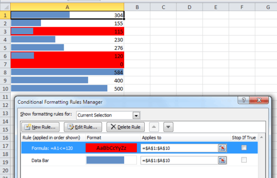
This is what happens when I apply the rule for red to appear if the value is less than or equal to 150. It appears that the red bar illustates relative values from 0 to 150...not 0 to 584.
Is there a way to combine these two rules? Ideally, I would have a data bar for each number that would show it's relative value, but SOME would be green and SOME would be red, based on being > < 150.
Is this doable?

That's what I was afraid of. That was my initial strategy, but I hated the way it looked. :) C'est la vie...thanks for confirmation that I should stop looking for a way to do this. Awesome Excel site by the way...I've got your site bookmarked; I know I'll need some of those chart tips eventually. – dwwilson66 – 2013-02-06T11:53:21.393