1
1
I am having a very hard time debugging this issue, I may as well find out if others have seen anything similar. I am finding that Webkit browsers are rendering extra space in a stacked menu I'm using for the mobile layout on a site I'm developing. The best way to describe this is with the following images:
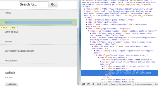
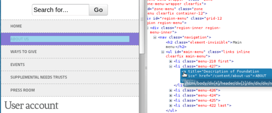
You can see that the is selected and shown with the padding. There is no margin, and yet there is some space between the top of the padding and the bottom border of the sibling. Here is how it is supposed to look in Firefox:
I am interested to see if the community knows what in the world is going on! As I move through the inspector, I am not able to highlight the offending area, making this very hard to diagnose, as I've said.

steve
Posted 2012-12-06T20:45:17.980
Reputation: 111

They're working here too @IanAtkin – djsmiley2k TMW – 2018-11-27T11:00:15.717
Yes they are now... 6 years later. :) – Ian Atkin – 2018-11-28T14:57:08.240
Your images are broken. – Ian Atkin – 2012-12-06T22:00:18.110
They work for me. What's happening when you click the links? – steve – 2012-12-06T22:10:07.047
I end up on a page with a broken image icon next to the image title, stats (0 views) and some social links. – Ian Atkin – 2012-12-06T22:11:35.950
That is strange, they are working for me as I write this, I'm not sure what to tell you. If others who view this post have the same results, I'll host the images myself. – steve – 2012-12-06T22:13:34.397