Could I save printer's ink/toner by changing the font?

48

11

I'm developing a Microsoft Word document that reached more than 200 pages and I want to print it using my Laserjet or my father's Inkjet printer.

I can save paper using both sides of each sheet, however I can't save ink/toner using smaller fonts or un-bolding words (I already did it), so I started wondering about the fonts that I was using.

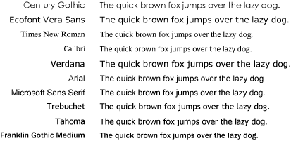
For example, the most used fonts, Arial and Times New Roman have specific and relevant differences with regards to ink consumption:

Arial font sample has uniform width across all the letters, and is more easily readable and "clean to see".

Times New Roman font sample has narrow width on center and an enlargement at the ends.

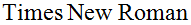
Using Times New Roman will certainly save ink/toner but will also "pollute" the reader vision over time.

So, there is some specific font (from more than 100 that I have on Windows) that could save ink and also keep a clean text?

Diogo

Posted 2011-09-28T14:41:09.933

Reputation: 28 202

There was an article on CNET "The right font can save you money". They changed the font of the text on the page and calculated ink coverage with APFill Ink Coverage Calculator software to find which font has the minimum ink coverage for a given text.

– valex – 2017-01-27T08:05:20.643

41You might think that Arial is more readable, but the usual consensus is that for printed (and thus much higher resolution) materials a seriffed typeface is easier to read (assumed that the serifs help guide the eyes along the lines). – Richard – 2011-09-28T15:45:57.363

9Plan A: Courier Light 6 point and a magnifying glass? Plan B: take it to a print-shop to print on an economical duplex laser? Plan C: Kindle – RedGrittyBrick – 2011-09-28T15:58:35.717

20Richard is totally right, how did you get the idea that serif fonts would "pollute the vision"? It is much, much more comfortable on the eyes in long texts. Why do you think are virtually all newspapers and books printed in serif fonts? Hint: toner is NOT a consideration, large newspapers care only about typography. – Felix Dombek – 2011-09-28T17:16:20.367

When I said "pollute vision" I mean that after reading 150 pages, you would get more tired than if you was rading an arial font. – Diogo – 2011-09-28T17:26:09.883

12@Diogo As far as I know, the eyes getting tired complaint is meant for serif fonts on screen, the rationale being that the serifs end up rendered as single pixels or non-black pixels. The clean outlines of sans-serif fonts have higher and more consistent contrast on screen. The "pixel" density of even cheap printers is much, much higher than that of computer displays, meaning that even the thinned segments of serif fonts end up having great contrast, while the serifs create "virtual" horizontal lines for the eye to follow, making reading long passages of text more comfortable. – millimoose – 2011-09-28T18:26:33.380

1

@Diogo Also, Times New Roman is particularly "dramatic" about the difference in thickness of its thin and thick segments. You could try something less uneven, like Hoefler Text, Georgia, or Lido STF. Also bear in mind that ClearType tends to mangle serif fonts quite a bit, so Times New Roman will look much thicker on paper. That said, there is no accounting for taste, pick what you like first and foremost.

– millimoose – 2011-09-28T18:32:16.620

10Q: "Which font would save more printer's ink/toner?" A: "A white one." – Iszi – 2011-09-28T19:30:49.467

The reason serif fonts are easier to read is probably more related to that the serifs give more shape to both the letters and more important, whole words. Familiar shapes are read one word at a time, rather than the individual letters. Btw, Times New Roman is hand-hinted rather extensively for smaller sizes, which is why it may look thinner on the screen that it "really" is. – None – 2011-09-28T20:35:31.180

1Very good question. Let's hope that Google has noticed the given issue. - Please, bring us Century Gothic or other ecological font to Google Docs to cut us living expenses. – Léo Léopold Hertz 준영 – 2011-09-28T21:21:11.913

I personally find sans fonts easier to read anywhere, on account of being dyslexic YMMV if you arn't. – Journeyman Geek – 2011-09-29T10:37:20.723

Answers

60

University of Wisconsin Green Bay changed to Century Gothic, which they claim uses roughly 30 percent less ink when printed on paper. Here's an article on the University change.

Folks at Ecofont say theirs saves more. Looks like a bit of a debate but ongoing research might find a winner.

Here is an EcoFont comparison with other well known fonts.

enter image description here

Here are Arial and EcoFont compared:

enter image description here

Dave M

Posted 2011-09-28T14:41:09.933

Reputation: 12 811

2Nice, I will take a look at the article. Thanks – Diogo – 2011-09-28T14:53:12.540

12Just notice that ecofont isn't free... – woliveirajr – 2011-09-28T19:12:44.867

Seems like Ecofonts are a modification of the Bitstream Vera fonts. :( – Broam – 2011-09-28T19:46:46.503

4ecofont: the White Castle of typography – horatio – 2011-09-28T20:01:48.723

there's a free version - as linked on my answer. – Journeyman Geek – 2011-09-29T00:16:09.027

28

I'd suggest using draft mode - its faster and uses less ink.

There's also a font with holes in it by a company called ecofont which you can download here based off bitstream vera

Two other fonts to check out - Secret Code for VERY thin stroke weight, and its still sans serif for most part. If you wanted to print small and legible, maybe Tiny - which is readable up to font size 4 (tho, not the best idea for a large amount of text) - both free fonts from squaregear/i shot the serif

Journeyman Geek

Posted 2011-09-28T14:41:09.933

Reputation: 119 122

quite honestly, i don't print text in anything else. – Journeyman Geek – 2011-09-29T09:31:25.263

10

At some point the cost of printing the document on an inkjet printer becomes more than the cost of purchasing an inexpensive laserjet. Depending on coverage (the percentage of the page covered with ink) the cost in ink to print a 200 page document can quickly approach $10-$15, and this is if you've optimized the fonts and are using whatever Eco-mode your printer supports.

At this price, printing the document ten times will cover the price of a new inexpensive HP laser printer. Printing black only on an inexpensive laser printer can result in up to a 10x price reduction. By my own figures, pages printed on my office laserjet printers cost less than 2/10 of a cent per page. While these are enterprise-class printers that have much lower cost per pages than consumer level laser printers, the economics are not too far off. Cost per page on my own HP Laserjet 1050 at home has been around half a cent compared with 2-3 cents per page inkjet.

While this in no way answers the specifics of your question, I believe that if you are planning on needing to print this document more than 5 times along with normal everyday printing in a home setting, you'll find a laser printer will be very much less expensive. Not to mention that laser printers, due to their fewer moving parts (no ink carriage running back and forth, just heaters and paper-moving rollers), tend to have longer lifes and lower total cost of ownership.

music2myear

Posted 2011-09-28T14:41:09.933

Reputation: 34 957

Is "laserjet" actually a type of printer, or just one of HP's product lines? I've always called them "laser printers" (a jet of laser?? I can understand a jet of ink...) – BenjiWiebe – 2014-12-27T14:30:21.023

Frankly, they've become a bit interchangeable to some people. Yes, "LaserJet" is specifically an HP product line. But just like we say "Give me a kleenex" when we really mean "give me a tissue", "LaserJet" has also become a bit of a general term meaning laser printer. However, as it is also a brand, I would do well to try to reserve the use of "LaserJet" for when I'm specifically referring to HP Laser printers so branded. – music2myear – 2014-12-29T14:38:04.257

8

Sans Serif fonts are easier on the eyes on a digital display. On paper, serifs are easier to read.

As far as ink goes, this sounds to me like a calculus problem. What is the area of each glyph? I'm not great at this, but someone who knows how to do calculus well can tell you the exact amount of ink this would take.

Personally, I'm in favor of the serif font. Keep in mind that if you use "draft mode", you use less ink as well. Depending on the quality of the printer and the quality settings of the draft mode, your mileage may vary.

Moshe

Posted 2011-09-28T14:41:09.933

Reputation: 5 474

I believe also that the area of each glyph would be affected (at least using a proper typesetter, with kerning, like LaTeX) by how much it adjusts the scale of each glyph. – new123456 – 2011-09-28T23:50:39.027

6

Serifs are easier to read in large amounts of text – regardless of whether on screen or on paper – because the letterforms are easier to distinguish (although it depends on the typeface).

• Times New Roman was designed for newspapers, not for the kind of paper I expect you'll be printing on.

• Arial is a copy of Helvetica (look at the uppercase R's in both fonts). It is ugly and unprofessional.

With a font like Lucida you could set your work in a much smaller size and still retain a comfortable reading experience. This is because the counters (the holes in between letters) are larger than both Arial and Times New Roman.

Robin Rendle

Posted 2011-09-28T14:41:09.933

Reputation: 61

4I'm pretty sure by now everyone knows that Arial is a poor man's Helvetica. – jcolebrand – 2011-09-28T16:52:47.450

3Apparently not, otherwise they would stop using it. – Robin Rendle – 2011-09-28T18:35:23.570

Is there a Helvetica that is hinted for screen use? – None – 2011-09-28T20:42:27.363

Why Helvetica? For the web you could use something that is far more legible like — http://typekit.com/fonts/ff-basic-gothic-web-pro or the typeface that Helvetica copied — http://www.christianschwartz.com/haasgrotesk.shtml

– Robin Rendle – 2011-09-28T23:06:27.847

2

I don't know the precise answer to your question, but you need to minimize average fill rate per printed character. You can do this by figuring out the fill rate of a font (the percent of the page that is covered by a page full of random characters) and dividing it by the number of characters that fit on the page. Which ever font gives the lowest number will save you both ink and paper.

You might try to fill a page with random characters, then convert it to a graphic and calculate the ratio of black to total pixels and the number of characters (you could write a (relatively) simple computer program to do it automatically for every font on your system).

Fun Fun Fun.

Tim Seguine

Posted 2011-09-28T14:41:09.933

Reputation: 129

1

Is it worth going with adjusted fonts?

What about adjusting the amount of ink that is used per droplet?

Depending on the print system (HP, Canon, Epson) there is a limit as to how much you can reduce the quantity used per droplet - when set optimaly will ensure that you are using sufficient ink so that it is comfortable contrast to read - not too light - but less ink than would be used by the driver by default. I've not used the latest inkjet printers and drivers, but I have seen the ability to lower the intensity or saturation of the output by some setting in the printer's preferences configuration, and that is then saving perhaps up to 50% of the ink VS the default setting.

I also found the default amount of ink to be too much for your standard thickness 80gsm office paper (80gsm - 80 gram per square meter of material).

offchaos

Posted 2011-09-28T14:41:09.933

Reputation: 31