Photoshop text spacing issue

0

I am having a problem with letter spacing in Photoshop (CS5, Mac)

Word: Mister, "i" has too little spacing left and right.

This occurs when anti-aliasing is on "none" and is most noticeable on small text. I already experienced this problem before but fixed it somehow (was on Windows), can't figure out now.

I already tried to reset the settings. Did not help.


UPDATE: Here are two screenshots. One from Windows 7 (with the Photoshop interface around it) and another (without the interface) is the same PSD file opened in Photoshop in OS X. You can clearly see the bugginess.

Windows:

OS X:

Oleg

Posted 2011-08-04T08:56:23.933

Reputation: 3

1What font are you using? – Benoit – 2011-08-04T09:21:33.570

Arial and Tahoma both have strange spacing between some letters. – Oleg – 2011-08-04T10:46:32.997

for all the answers. I have been using photoshop for a long time on Windows without this problem occurring. Now that I am on osx I am experiencing weird spacing. I will upload some better screenshots in a while. (Thanks for all the help!) – Oleg – 2011-08-14T12:56:50.537

I don't think it's right to call it a bug, it's more like a quirk of the software. Also, OSX might be using slightly different font files? Are you using the same version of Photoshop on both systems? Either way, I'm pretty sure the easiest way to fix this is just alter the tracking. If that's not an option, try the Adobe forums and put emphasis on the differences in font-rendering in Photoshop. OSX undoubtedly has its own font-rendering that's different to Windows, but if you're sure it's just in Photoshop, then try there. – Django Reinhardt – 2011-08-20T17:23:42.930

This has been resolved in Photoshop CS6. Fonts are being displayed properly there (meanwhile I've grown to use anti-aliasing). – Oleg – 2013-01-02T11:48:26.897

Answers

3

There is a lower limit to the readable size for any font.

Font sample

The above is Windows Vista Wordpad, Arial at 14,12,11 and 10,9,8,7,6 points, viewed through the accessibility magnifier.

You can see the same problems at 7 points.

It isn't necessarily a problem with Photoshop in general. the Mac version of Photoshop or with Mac OS X.


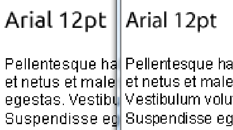
Update: The images in your updated answer do clearly show a difference between Windows and OS X typography. It does look almost as if OS X has substituted a different font and got the metrics slightly wrong. Here's a zoomed portion of your Windows and OSX images

Zoomed comparison

The u is clearly different and the kerning is noticeably worse in the OS X sample. (Though it is clear one can't be too picky at these low dpi and small font sizes). Do Macs still use a different dpi to Windows (96)?

The headings "Arial 12pt" - though not in Arial, are clearly also even more different in the two samples - which suggests some font substitution is going on (at least for whatever font was used for the headings)

What happens if you type the same text in Arial 12pt into native apps on each platform (e.g. Wordpad on Windows and whatever is equivalent on OS X)?

RedGrittyBrick

Posted 2011-08-04T08:56:23.933

Reputation: 70 632

I have uploaded the screenshots from both systems and same psd file. The is clearly a problem on OSX compared to Windows. Could the fonts on OSX just be somehow different? Could I take those from Windows and replace the ones in OSX? – Oleg – 2011-08-14T13:29:59.473

also the problem arises at 12 points already :( – Oleg – 2011-08-14T16:13:17.100

thanks for the update. Don't mind the headings, I have used different fonts there, because I do not have "Ubuntu" font on osx. I will respond with the screenshots from native apps in a couple of hours. – Oleg – 2011-08-14T21:51:34.113

1

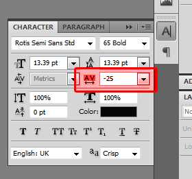
Not sure why you'd want to turn off anti-aliasing, but if that's what you need, then really it's just an issue with the font being too small. An easy fix, however, is to increase the tracking (the space between the letters). You can do this by increasing the number in the box I've highlighted below.

enter image description here

Django Reinhardt

Posted 2011-08-04T08:56:23.933

Reputation: 4 183

Sometimes anti-aliased fonts (especially smaller sizes) look to smooth or bold. In these cases (mostly on 10-11px sized fonts) I turn off the anti-aliasing. I know this setting, but it increases the spacing between every letter. My problem is that some letters have too much spacing, some too little. Pretty weird. – Oleg – 2011-08-14T13:00:38.590

1

I think the best solution is to put the cursor between the tightly spaced letters, hold down Option, and use the left and right arrow keys to adjust the kerning between those two characters (not the tracking, which is for increasing the letter spacing globally).

Matt M.

Posted 2011-08-04T08:56:23.933

Reputation: 580

+1 Yes, this is also a good option. – Django Reinhardt – 2011-08-08T10:57:39.593

this is too much manual work. Sometimes I need to add a whole bunch of text and it would be a pain to edit each letter spacing individually. – Oleg – 2011-08-14T12:58:04.767

0

It all depends on which font you choose. Some fonts have proper kerning and hinting tables and some fonts do not. Some fonts kern and hint well at small point sizes and some do not. If you want to use a certain font, and it doesn't kern and hint automatically, you need to manually over-ride the kerning. Other fonts that are better quality will not require the extra work.

user93417

Posted 2011-08-04T08:56:23.933

Reputation:

Tahoma, Arial, Verdana all appear great on Windows, but not on OSX. Those are ones that matter most to me. But nevermind, this has been resolved in Photoshop CS6.

Thanks! – Oleg – 2013-01-02T11:49:42.107

0

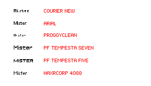
Some fonts just don't render well in small sizes. Here's what some fonts look at 12px in Photoshop (anti-aliasing set to None; kerning set to Metric).

enter image description here

If you must use really small text with no anti-aliasing, use pixel fonts for them. Note that pixel fonts need to be sized appropriately too. I prefer HaxrCorp, but here are other examples:

Ellesa

Posted 2011-08-04T08:56:23.933

Reputation: 9 729

I have no problem with Arial and Tahoma on Windows and have been using them for a long time, please see the edit above for screenshots. (thanks for the pixel fonts though) – Oleg – 2011-08-14T13:31:22.670

0

Changing tracking for individual instances of the "i" would be tedious.

Try messing with metrics options: by selecting all the text and changing the option to Optical or setting your own figure

mxrclxst

Posted 2011-08-04T08:56:23.933

Reputation: 89