2
1
There is probably a fairly straight forward answer out there but I can not seem to find a solution online.
I have a table marked up like this (column names are in bold)
audit date | blindness
10/17/2001 | red
10/17/2002 | green
10/17/2003 | yellow
10/17/2004 | unknown
10/17/2005 | red
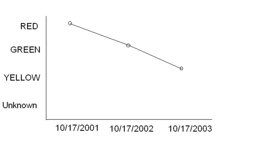
I would simply like to make a line graph in excel, where the audit date values are the X-axis categories, and the blindness values are the Y-axis categories.
I have tried so many little tutorial's online but my graph never comes out looking correctly. I can not get the axis the way I'd like.
PS - I am using Excel 2003
This is exactly what I would like to see.

for the y values you ned to transform the red, green etc to a number for a line graph? What values do you choose? – user151019 – 2011-04-20T15:28:33.957
Hmm, so its not possible to list the colour values, (red/green/yellow) on the Y axis, and have the line graph create a marker at red for x value 10/17/2001? – Chris Buckler – 2011-04-20T15:31:19.857
can you sketch the result you want on MS Paint or similar program just to see it? – kokbira – 2011-04-20T17:27:17.377
@kokbira I have edited my question to include a machup in mspaint. Thanks! – Chris Buckler – 2011-04-20T17:37:31.857