2
1
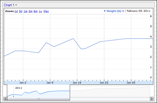
Google Docs has a nice trend viewer that can be created just like any other chart:

Is there any way to get an interactive graphic like this in OpenOffice? Manually adjusting the axes is really annoying.
2
1
Google Docs has a nice trend viewer that can be created just like any other chart:

Is there any way to get an interactive graphic like this in OpenOffice? Manually adjusting the axes is really annoying.
0
Interactive? No. Openoffice is designed for print / static type outputs, whereas Google Docs is a step away from that and expects all of its users to be on the Web. This component in particular is a Google Charting piece that Google leverages on its other properties including Analytics and Finance.
"Designed for print output" doesn't mean it can't be easy to use. – endolith – 2011-06-16T21:42:44.340
2I think what you are looking for is an interactive data analysis tool. Google Docs makes sense for this, and there are plenty others out there. I would even bet that OpenOffice has plugins or modules that will add interactivity to its charts... actually, since OOo is open-source and the Google Charts API is public, a decent developer could create a module that leverages this exact component to give you the interactive chart you desire. Seems like a pretty straightforward and potentially simple project for someone already familiar with OOo's code. – Joshua – 2011-06-17T17:47:51.080
1Yes, that's the sort of thing I'm asking about. – endolith – 2011-06-17T18:31:58.147