How to add new fonts to your Powershell (Or CMD) Console settings?
First thing to know, is that, unfortunately (!):
Only fonts fulfilling certain criteria can be installed into the console!
(See: here, here and here.)
The Font Criteria + Explanation
(The current status of this is unknown.)
For Font to be supported in Console they have to:
- The font must be a fixed-pitch font.
- The font cannot be an italic font.
- If it is a TrueType font, it must be
FF_MODERN.
- If it is not a TrueType font, it must contain the
OEM_CHARSET.
- The font cannot have a negative
A or C space.
What does all that mean?
Most of these metrics are defined here, which outlines the following structure describing a font in C++:
typedef struct tagLOGFONTA {
  LONG lfHeight;
  LONG lfWidth;
  LONG lfEscapement;
  LONG lfOrientation;
  LONG lfWeight;
  BYTE lfItalic;
  BYTE lfUnderline;
  BYTE lfStrikeOut;
  BYTE lfCharSet;
  BYTE lfOutPrecision;
  BYTE lfClipPrecision;
  BYTE lfQuality;
  BYTE lfPitchAndFamily;
  CHAR lfFaceName[LF_FACESIZE];
} LOGFONTA, *PLOGFONTA, *NPLOGFONTA, *LPLOGFONTA;
The font must be fixed-pitch. pitch and family of the font is described by the field lfPitchAndFamily. The two low-order bits specify the pitch of the font and can be one of the following values:
DEFAULT_PITCHFIXED_PITCHVARIABLE_PITCH
The font cannot be italic. In other words, the lfItalic field must be set to false.
If it is a TrueType font, the lfPitchAndFamily field must contain the code for the FF_MODERN family, in bits 4 through 7. FF_MODERN describes fonts with a constant stroke width (i.e. monospace fonts), with or without serifs. Monospace fonts are usually modern. Pica, Elite, and CourierNew are examples.
If it is not a TrueType font, it's charset must include OEM_CHARSET, as defined by the lfCharSet field in the tagLOGFONTA structure. That is, the font needs to be more than merely monospace. It also needs to support all the characters in the OEM code page, the 437 "OEM" characters of the IBM437 (OEM United States) char set as described here.
The font cannot have a negative A or C space. The width of a character is described by an ABC structure. The B spacing is the width of the character. The A spacing is how much space to leave on the left of the character, and the C spacing is how much margin to leave on the right.
Any character with a negative margin on the left or right is oversized the designated grid/raster. For example, a font with an overloaded W needs more space than the designated X pixel character width to properly draw the character. Obviously, fonts with oversized characters are not fixed-width.
However, one known font to work and that has been suggested because it supports a lot of useful glyphs and math, is DejaVu. Unfortunately it is not part of the Windows standard font selection
and need to be installed manually.
If the font you need doesn't already have a TrueType font file (*.ttf) or
OpenType (*.otf), you will need to convert the SFD files into TTF (or OTF). To do so, you can use FontForge to
import SFD and then generate the TTF.
Steps to install a TTF file using FontForge
- Install FontForge (hereafter "FF")
- Run FF as Administrator
- Download the SFD font file(s) (For example: DejaVuSansMono.sfd.)
- Open the file with:
File > Open and hit OK.
- Generate a TTF with:
File > Generate Fonts..., then
- Select
True Type in the drop-down, then
- Un-Select the
Validate Before Saving option and hit Generate.
- Drag the resulting
*.ttf file into the Windows Control Panel for Fonts found at:
(Control Panel\Appearance and Personalisation\Fonts) or by:
WIN+R and type: %windir%\fonts.
Done. The new font is now immediately available in your registry.
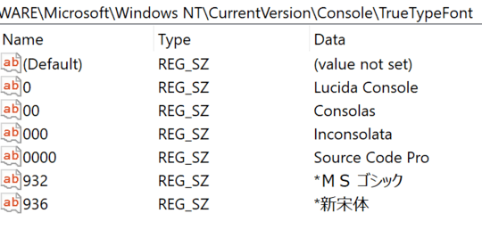
Load the new font(s) into the Console registry
Open a Powershell console as Administrator to do this.
# All your available fonts are located here:
$T1key = 'HKLM:\Software\Microsoft\Windows NT\CurrentVersion\Fonts'

# But your Console fonts are located here:
$T2key = 'HKLM:\SOFTWARE\Microsoft\Windows NT\CurrentVersion\Console\TrueTypeFont'

# Check the correct name:
Get-ItemProperty -Path $T1key | grep "DejaVu"
DejaVu Sans Mono (TrueType)     : DejaVuSansMono.ttf
# Note the correct spacing of the name and ignore the "(TrueType)" part

# Check what's already there:
Get-ItemProperty -Path $T2key

# To add more fonts, just add the new name like this:
# - Add another 0 (zero) to the -Name parameter, for each new font
# So since there is already an item with two zeros, so we need 3 and 4 zeros...
#Set-ItemProperty -Path $key -Name '000' -Value 'Arial'     # Doesn't work!
#Set-ItemProperty -Path $key -Name '0000' -Value 'Calibri'  # Doesn't work!
Set-ItemProperty -Path $key -Name '00000' -Value 'DejaVu Sans Mono'
However, you will not see the new font items, until:
- the registry has been reloaded into memory, so the only way is to either:
- reboot the computer or
- restart
Windows Explorer.
- Restart your Powershell Console
- File a bug report to Windows
Powershell repo Console repo and ask them to:
support proper Fonts with correct unicode glyphs.
Enjoy the many new and correct glyphs!
For example, try the 5/8th box:
[char]0x2585 # (U+2585)
Addendum:
The Expand Stroke dialog gives you control over various aspects of the
expansion process. First you can specify three types of pen nibs:
- A round pen, which is circular by default but may be transformed into an ellipse
- A rectangular pen, which is square by default but may be transformed into more traditional caligraphic nib shapes
- A polygonal pen – you can draw almost any convex polygon.
For circular and caligraphic pens you can chose a stroke width, how
the ends of an open path should be drawn, and how the path should look
when two splines (or lines) join which do not have the same slope (ie.
at a corner point).


That method works fine on Windows 7 (which is what they use in the example). I've just tested it now. You might need to search for something specific for Windows 10. – Michael Frank – 2018-08-09T23:59:02.033
Microsoft has developed and released (open source, I believe) a theme tool for the console for the latest builds of Windows 10: https://blogs.msdn.microsoft.com/commandline/2017/08/11/introducing-the-windows-console-colortool/
– music2myear – 2018-08-10T00:04:59.7701@music2myear I just tried out the tool you've linked to, and it only handles colors. It has nothing to do with fonts. – soapergem – 2018-08-10T21:02:46.970
Good to know. I installed it and was playing around with it today, but got sidetracked before I could test fonts with it. – music2myear – 2018-08-10T21:17:40.430
1
not all fonts can be used. They must match a lot of conditions to work. See Necessary criteria for fonts to be available in a command window, How to add additional fonts to the Windows console windows, How to add a font to the Cmd window choices in Windows 7 64-bit?
– phuclv – 2018-09-04T02:01:57.0232If you want a customisable terminal then use mintty. – Biswapriyo – 2018-09-06T07:29:06.287
Try updating to 17134.228 :) – var firstName – 2018-09-07T20:35:29.230
Courier New works, see https://stackoverflow.com/questions/9321419/unicode-utf-8-text-file-gibberish-on-windows-console-trying-to-display-hebrew
– barlop – 2018-12-09T19:16:07.250