How can I quickly open a mobile view of a page in a desktop browser?

51

22

Since we're now in a mobile-first world, it becomes more and more important to be able to test websites easily on mobile phones, or on emulated mobile phones. I collaborate with people who work on websites and social media offerings, and I would like to encourage them to regularly open websites from their desktop browsers in a mobile view. I'm specifically thinking of the browser's built-in "mobile view" feature, which is often hidden among all the other developer tools a browser provides, but I'm happy to consider anything which is just as quick to set up.

How can you open a mobile view of a website from a desktop browser?

Flimm

Posted 2018-02-06T09:49:29.757

Reputation: 6 317

23"Since we're now in a mobile-first world" Woah there a minute... context is for kings. – Lightness Races with Monica – 2018-02-06T12:49:22.480

3Just a comment - don't know the context really, but if I was asked to be opening webpages from my desktop/laptop in mobile view first ....what's the point of using the desktop? I hope by "encourage", you're not forcing it via some code or other method. Especially since many webpages that do format for mobile are pared down quite a bit and don't have full functionality. – BruceWayne – 2018-02-06T16:27:34.250

1Add a change user agent or similar extension or plug in to your browser, and set a smart phone user agent. – Salman A – 2018-02-06T17:10:15.410

How does the site detect whether to send back a mobile view or not? It depends heavily on this. – jpmc26 – 2018-02-07T00:06:55.607

1

“I would like to encourage people to regularly open websites from their desktop browsers in a mobile view.” ...That's goofy. And waste all that desktop screen real estate? Desktop and mobile both have their place, and that's why responsive solutions have been developed. Let's deliver the best experience possible for every user, and let people browse on the device that's most comfortable for them. Anyway, valid question, as web designers and developers need to emulate multiple devices when building sites.

– Mentalist – 2018-02-07T02:52:03.130

2@Mentalist I meant people who are working on websites and social media offerings. – Flimm – 2018-02-07T07:28:42.287

Makes sense in that context. :-) – Mentalist – 2018-02-07T07:31:10.377

@LightnessRacesinOrbit here's some context: more than 50% of web traffic comes from mobile devices. For us web developers, testing websites on mobile devices is paramount. https://bgr.com/2016/11/02/internet-usage-desktop-vs-mobile/

– Andrea Lazzarotto – 2018-02-08T17:21:41.920

@AndreaLazzarotto: That's a very weak statistic without further context. How much of your traffic comes from mobile devices? I imagine a lot of Twitter, Tumblr, Facebook etc is from mobile because people do a lot of social media on the go. Take what's left and get another number. I bet it's substantially different. What about everybody who is behind a computer screen all day long at work? What about technical websites? (cont.) – Lightness Races with Monica – 2018-02-08T18:42:09.993

(cont.) Finally, even if we could rely on that figure, 51.3% is hardly a wide margin: it's effectively 50/50. So, what you're really doing is saying "people use desktops just as much as they use mobiles", which reframes your question quite a bit. – Lightness Races with Monica – 2018-02-08T18:43:25.443

@LightnessRacesinOrbit 52% was enough for Brexit, apparently :p But joke aside, personally I have my site set up so that Alt+1 through Alt+4 reduce the content width to that multiple of 320px. It's pretty effective for testing what things look like on mobile screens. Alt+5 resets to full width. – Niet the Dark Absol – 2018-02-08T19:21:05.860

@LightnessRacesInOrbit first of all, it is not my question. Secondly, even if the mobile traffic amounted only to 20%, it would be batshit crazy not to test on mobile. My clients would never hire me again if I delivered a site which is broken on mobile. Go tell them "well, 1 out of 5 people will not be able to use your site and buy your products, but come on... It's not a big deal right?"... – Andrea Lazzarotto – 2018-02-09T01:01:08.917

@AndreaLazzarotto: Nobody advocated against testing on mobile. – Lightness Races with Monica – 2018-02-09T10:29:42.047

Answers

93

Firefox:

  • In Windows/Linux, press Ctrl+Shift+M
  • In macOS, press option+command+M

You can also find the menu item under ("Tools"), "Web Developer", "Responsive Design Mode".

Chrome:

You need to have "Developer Tools" open first:

  • In Windows/Linux, press Ctrl+Shift+I or just F12
  • In macOS, press option+command+I

Once developer tools is open and focused, you can open the device toolbar:

  • In Windows/Linux, press Ctrl+Shift+M
  • In macOS, press command+shift+M

You can also find the menu item by opening developer tools ("More Tools", "Develepor Tools"), and then clicking the icon that looks like a mobile phone in front of a table "Toggle device toolbar".

Safari:

It looks like Apple have disabled by default the keyboard shortcut for entering responsive design mode. You can follow this tutorial on configuring a keyboard shortcut for it.

You can find the menu item by clicking "Develop", "Enter Responsive Design Mode". If you can't see the "Develop" menu item, you need to enable it by opening "Preferences", "Advanced", and ticking "Show Develop menu in menu bar".

Edge:

  • Press F12 to open the developer tools, and then Ctrl+7 to open the "Emulation tab". Configure the device you want to emulate.

You can open the developer tools using the mouse by right-clicking inside the webpage, and choosing "inspect element".

Flimm

Posted 2018-02-06T09:49:29.757

Reputation: 6 317

1Note that ctrl shift M works only if developer tools are already open – Naramsim – 2018-02-06T10:29:07.767

3@Naramsim Thanks. That only applies to Chrome. I've edited my answer. – Flimm – 2018-02-06T11:19:47.800

3For Windows/Chrome, F12 is a potentially easier way to get to Dev Tools... although if the next keystroke is going to be Ctrl-Shift-M, I suppose starting with Ctrl-Shift-I may be more logical. – sǝɯɐſ – 2018-02-06T13:21:03.240

I believe on previous versions of Safari Cmd+Shift+R would open responsive design mode. Seems to not exist on latest version unless you manually bind it – Downgoat – 2018-02-06T23:52:00.833

Chrome remembers if you wanted a mobile preview, so once you've enabled it, you can toggle between mobile/desktop simply using F12 – Pieter De Bie – 2018-02-08T12:26:16.503

12

Flimm’s answer is 100% correct. Just in case remembering the shortcuts is too much of a hassle, it’s this blue button in the Developer Tools to toggle between the web view and mobile/tablet view:

chrome

Or with Firefox:

firefox

After enabling the device toolbar, you can then choose the make and model of the device you wish to emulate from the dropdown menu.

Shobhit Garg

Posted 2018-02-06T09:49:29.757

Reputation: 121

1What piece of software does the first part refer to? – Kamil Maciorowski – 2018-02-07T05:22:45.273

@KamilMaciorowski DevTools is the developer tool found in Chrome and Opera. – OptimusCrime – 2018-02-07T07:46:03.483

@KamilMaciorowski This is not a software, this is available on any of your web browser. Specifically if you're using chrome, right click on any window and click on inspect and you will see this window in your browser docked below or to the right of the browser. These are more commonly known as Dev Tools. – Shobhit Garg – 2018-02-07T16:13:29.030

@Shobbit Garg Is that the windows, which opens when I press CTRL + Shift + C? – daniel.neumann – 2018-02-08T08:22:06.967

@daniel.neumann Unfortunately I use mac, so I cannot test and see what happens when you press those keys. But referring to the shortcuts listed above, this window should open by pressing "ctrl + shift + I" on chrome, "ctrl + shift + M" on firefox or pressing f12 on IE/Edge. – Shobhit Garg – 2018-02-08T15:04:15.650

@ShobhitGarg : Thanks for the reply. I meant the Developer Tools to open with "CTRL + Shift + C". – daniel.neumann – 2018-02-08T15:49:40.777

2

For the purpose of testing, i use the following websites :-

  1. http://www.jamus.co.uk/demos/rwd-demonstrations/
  2. http://mattkersley.com/responsive/

Both of the above sites allow me to view my web application in multiple device widths.

23nigam

Posted 2018-02-06T09:49:29.757

Reputation: 121

1

Add a "user agent switcher" extension in your browser and specify a mobile user agent. If the website is smart enough it will serve you mobile optimized version.

I will not recommend any specific extension. The ideal one should have presets for mobile browsers built-in and the ability to enable or disable user agent switching on per-website basis.

Salman A

Posted 2018-02-06T09:49:29.757

Reputation: 1 318

1This is incorrect. Mobile layouts should work based on device / screen dimensions via CSS media queries, not user agent strings - it's not 2006 any more. – PiX06 – 2018-02-07T13:51:46.280

Most browsers' tool that allows a mobile view also lets you set a user-agent at the same time. – Flimm – 2018-02-07T14:33:19.493

1@PiX06 then no effort is necessary. Just resize the browser window! – Salman A – 2018-02-07T15:04:36.560

Unfortunately, I find myself with many questions: If I'm resizing the browser window anyway, why do I need to bother with user agents? To which dimensions should I resize the window? How do I measure the window? – Mathieu K. – 2018-02-09T05:26:00.870

0

The above answers are great for those who like to stick with a single browser, or have limited desktop "workspace" (eg. single monitor less than 21" at a low res).

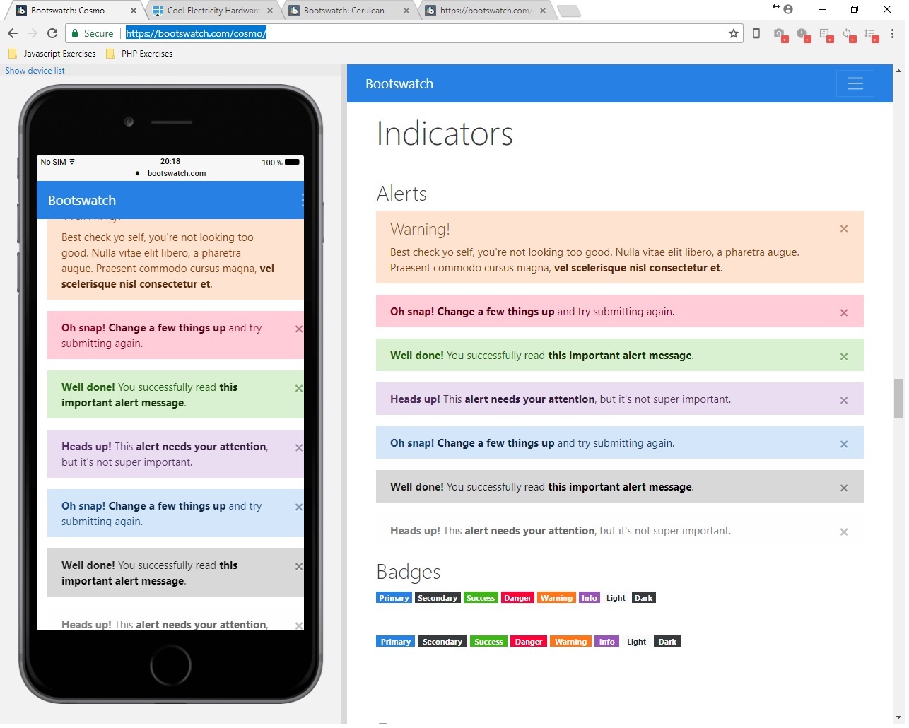
There is actually an even more interesting solution I've recently discovered: https://blisk.io/

I will refrain from using the (sort of) "affiliate link" for any personal gain (There is a "token based system" that you can earn credits to get things like free "team cloud space" & "premium features" to use with it), but Blisk is actually pretty snazzy.

This Chromium-based "browser built for development" provides a multitude of ways to demo the page in various devices with a vertical "pane" on the LEFT side, much like you see Chrome Developer Tools default to the right vertical column.

It's work a look. Though there are some limits to its "freemium extended functionality", it still works very well to "preview" both the PC and Mobile versions of your pages / sites in a side-by-side comparison. The paid features seem pretty rad too if you work in remote teams (though I personally think it need a better "test drive" program before hooking people on the monthly cost).

Full disclosure: there is an EXTREMELY annoying "time limit" per day on the mobile preview part (toggles open/closed from the icon to the right of the address bar - change the "device preview" from the tiny link-to-the-menu in the top right corner "Show device list").

BliskDemoScreenshot

Also: I've found a few really nifty tricks with Browser Extensions like the 2 different "User-Agent Switcher"'s from Chrome/Firefox that go a bit further by letting you toggle between browser user-agent strings of various Operating Systems AND the browsers for them.

I prefer the "esolutions.se" flavor because of how easy it is to add custom user-agent strings to the list for as many customizations as you could ever want (runs offline also, which can be handy in certain cases): https://chrome.google.com/webstore/detail/user-agent-switcher/clddifkhlkcojbojppdojfeeikdkgiae

Anyway, that's my 2 cents. :P

kanidrive

Posted 2018-02-06T09:49:29.757

Reputation: 16