3
0
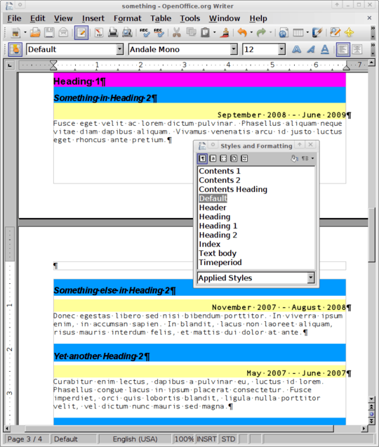
I'm writing a CV using the Word processor of OpenOffice 2.4 (the version in the normal Ubuntu Gutsy (maybe using backports, I can't remember)).
I'd like to have text in the Timeperiod style (yellow background) which I would like to have to the right of text in the Heading 2 style. My reason is that I want to conserve vertical space.
Using a table with invisible borders seems like cheating and semantically incorrect. Is there another, more correct way? (Note: I'm using the table approach in the meantime, as getting the CV done is more important. But I'm still curious about the answer and will adjust the document in case there is a better way.)

So you want to get the blue and yellow lines on exactly the same level, not one underneath another, and have the right-aligned timedate in a different font and size to the heading on the left? – random – 2009-08-08T10:45:08.420