47
14
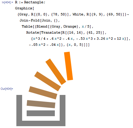
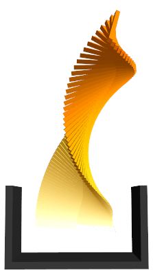
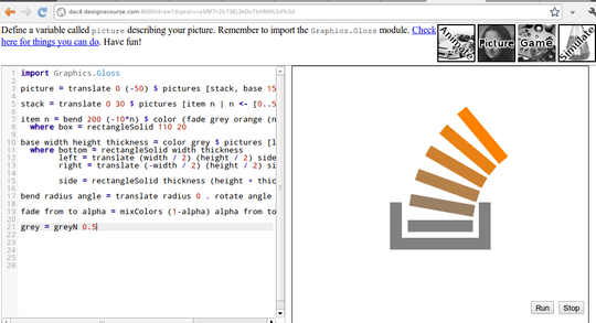
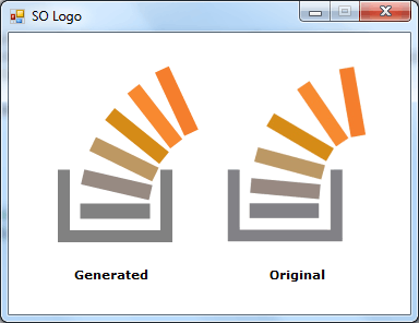
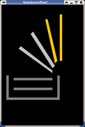
The challenge is to generate an image similar to the StackOverflow logo:

The output must contain:
- Image size 64*64 or greater
- A gray |__| shaped base
- A curved segmented stack coming up from the base. The segments will fade from gray to orange, and make a ~90 degree right turn. The number of segments should be between 5 and 7, with 6 being preferred.
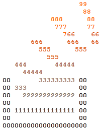
Note: For ascii displays that lack color, use a '0' character to represent gray, and '9' for orange. '1' to '8' would represent the shades in-between.
Restrictions:
- You must generate the image. Loading images or storing them in the code/binary is not allowed.
Additional rules/information:
- The image is not required to be identical to the logo, however it must be recognizable as it.
- The method of display is up to you. Saving it to an image file or displaying on the screen are both acceptable.
Judging/winning criteria:
- Accuracy of the image is the primary condition
- Elegance of generation is the secondary condition







3I'm not sure what it was like in 2012, but by today's standards this is not an objective winning criterion. I guess the best fix (which also wouldn't affect the winner), would be to turn this into a [tag:popularity-contest] and move the judging criteria to voting guidelines. – Martin Ender – 2015-02-28T12:47:01.197
@IlmariKaronen I count SIX. Also, that's 32x32px. – mbomb007 – 2015-09-18T01:21:41.220
1
@mbomb007: It looked different back in 2012.
– Ilmari Karonen – 2015-09-18T07:10:02.8701
The official 16x16 px version of the logo actually has only 4 bars in the stack.
– Ilmari Karonen – 2012-01-08T12:06:11.097